BUBBTALK: REDUCING SOCIAL ISOLATION AMONG OLDER ADULTS
Fall 2020 - 14 Weeks
HCI Foundations with professor Dr. Andrea Parker
CHALLENGE: During a pandemic, physical isolation for older, at-risk individuals is a necessity, but social isolation can have many negative health impacts. Our team wanted to support the expansion and maintenance of social networks in a virtual context.
MY ROLE: Some initial research, initial ideation, visual design, and interactive prototype development
Tools and techniques used include background research, remote user research, affinity mapping in Miro, vector graphics and data visualization in Sketch, interactive prototyping in Axure, and remote SUS evaluations.
Loneliness
34% of adults age 45 and older report feeling lonely.
Loneliness and social isolation in older adults is linked to adverse health outcomes including reduced cognitive function and early mortality. However, feeling socially connected and part of a community can reduce feelings of loneliness separate from actual social isolation. This is why our group decided to build a platform that helps older adults connect.
User Research
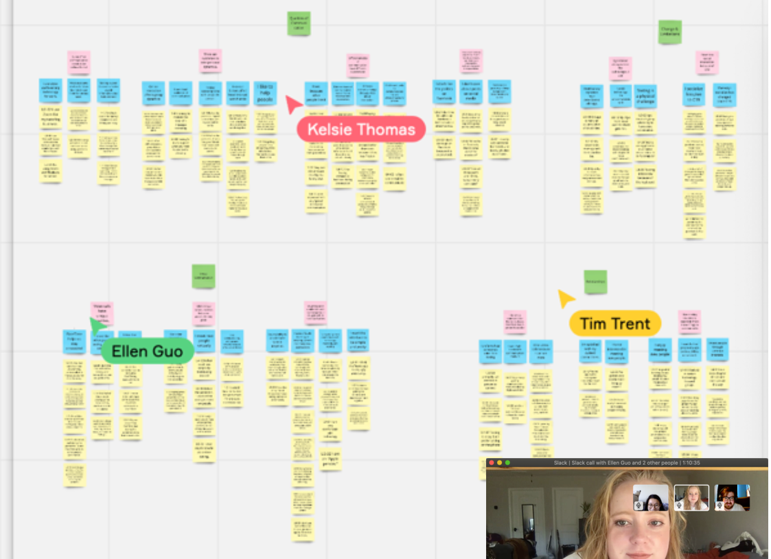
We conducted 60-minute interviews with five adults from age 51 to 65 to understand their Internet habits and how they've stayed connected throughout the pandemic. Our team then used affinity mapping to identify high-level categories and common themes, some of which are presented below:
Although texting is okay, users generally prefer calling to texting.
"I like to talk on the phone because you can hear someone's voice and actually have a conversation."
Video calls are great because they convey even more information.
"FaceTime allows me to watch my grandson in his environment, which I really enjoy despite the pandemic."
Most participants want to meet people around their age with similar interests.
"I'm worried that since I'm not meeting people due to the virus, I'll get stagnant."
"When I took an exercise class with my younger friend, it was too advanced, and I felt like I was too old."
Participants think Facebook is the best way to keep in contact with friends and family, but have stopped checking their accounts due to increased polarization.
"Everyone is on Facebook, so it's a good way to keep people informed."
"I don't like to go on Facebook because it is so polarized."
As our users age, their experiences of technology change; physical and cognitive changes mean they are less likely to use certain devices and apps.
"My long-term memory isn't the same—I used to be really good with names, but I have trouble now and it really bothers me."
"My mom is scared that the iPad will go off and she won't know what to do."
"I get tired of typing when I try to have a text conversation."
Design Requirements
Functional
- Allows users to communicate through video and/or voice
- Helps users find groups of people around their age with shared interests
- Does not increase the number of apps users need to use
Non-Functional
- Easy to learn
- Uses inclusive language
- Safe and enjoyable to use
- Modern aesthetic (NOT "assistive")
- Can be accessed on a desktop or laptop computer
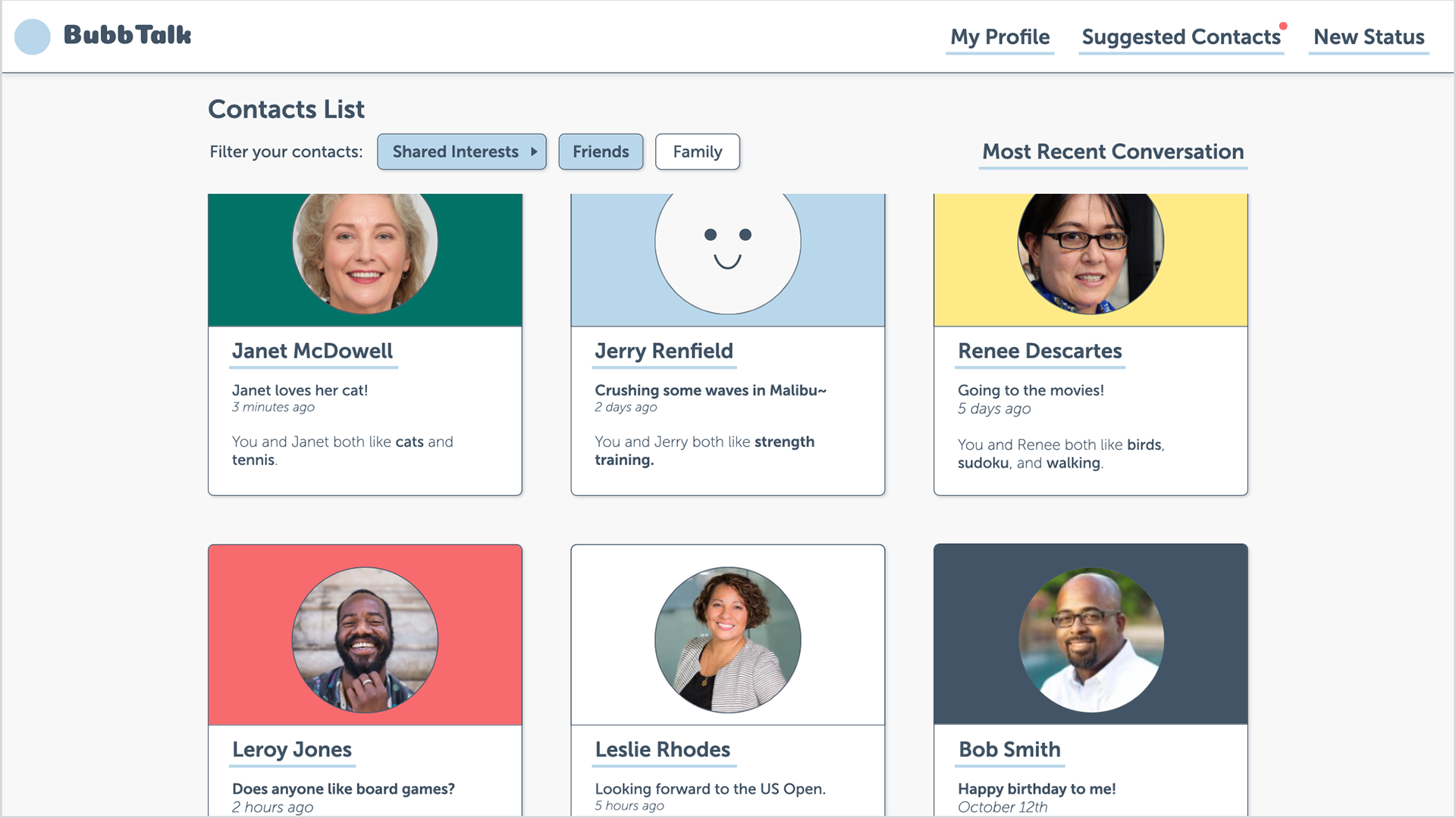
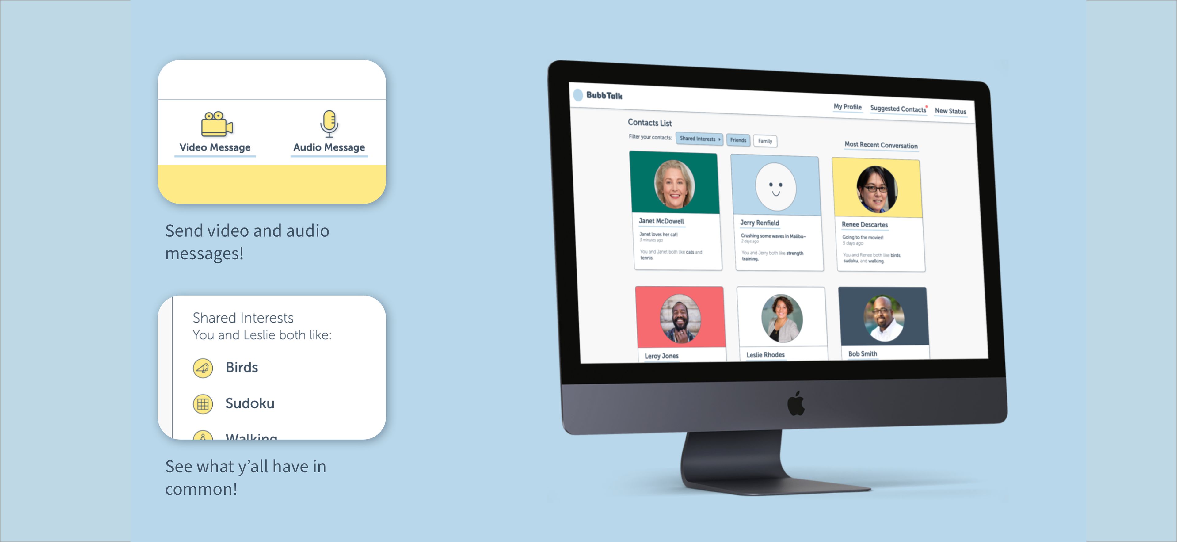
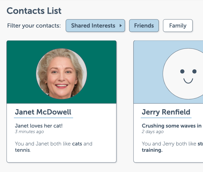
The contacts list shows users' brief statuses and common interests. The contact cards can be filtered by specific shared interests or by which group the user has assigned them to, such as "friends" or "family." Invoking the card metaphor helps orient users in a familiar mental model and is easier to translate for different screen sizes.
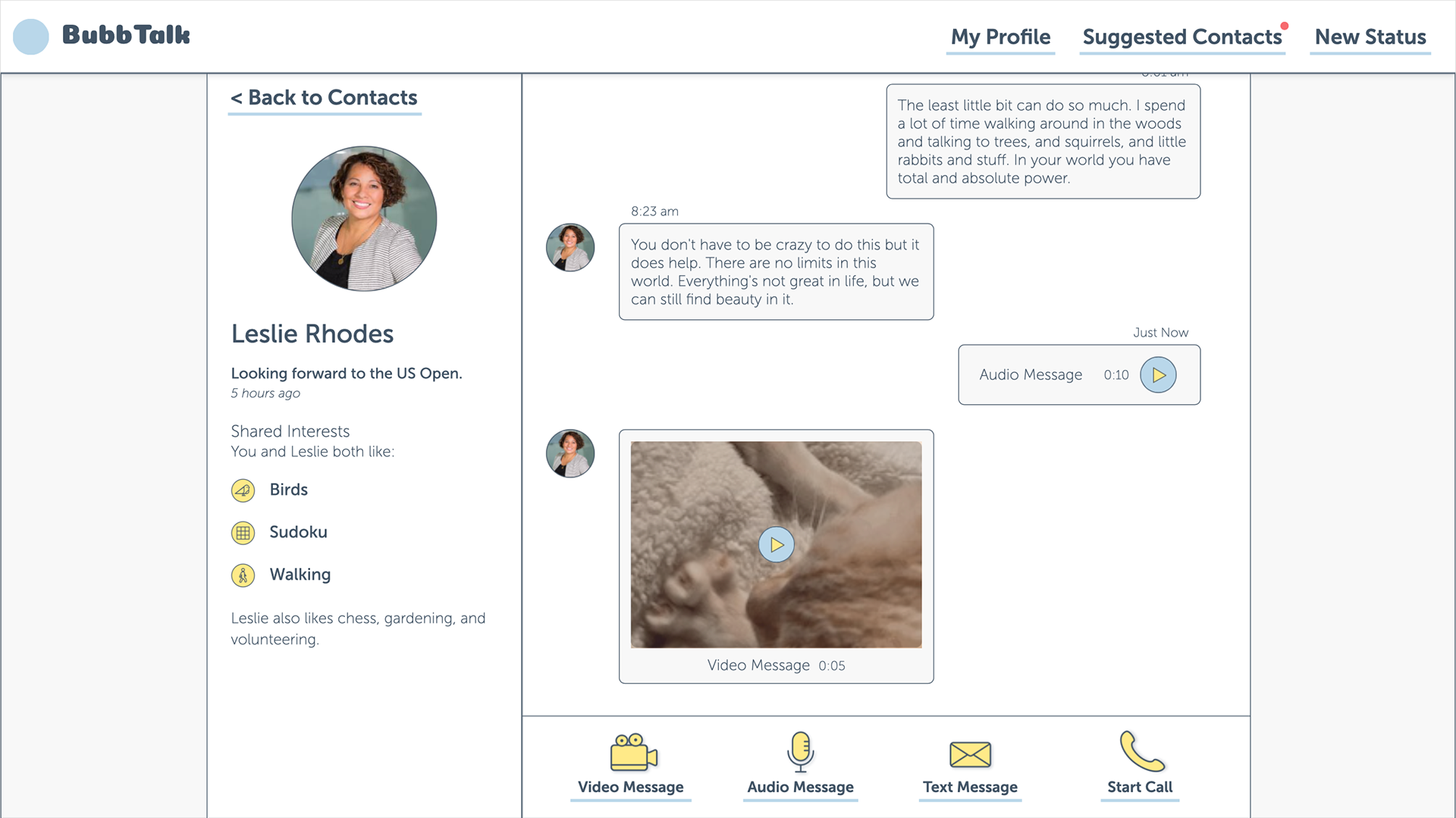
The main function of the platform: conversations. The sidebar gives a summary of the current contact, including a large profile image to emphasize that individual connection and a list of shared and other interests to help keep the conversation moving. The various forms of messaging are all placed on the same hierarchical level, instead of a text box with smaller sub-functions, to encourage other forms of messaging.
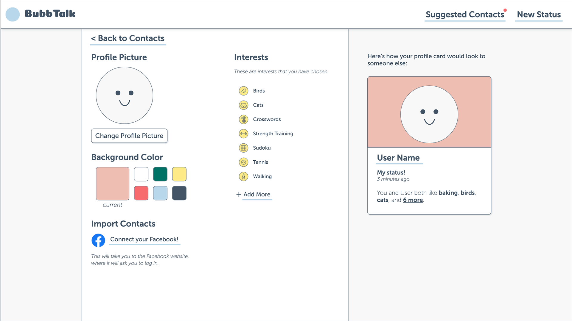
The user profile allows a degree of customization for users to convey their personality without deviating from a consistent aesthetic experience. The option to import Facebook contacts allows users to take advantage of existing connections on the megaplatform. The profile card on the side adds a layer of safety so users can see the impact the changes they make.
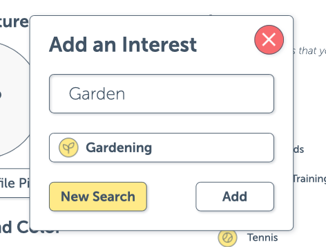
pop-up
animated hover effect
shadows & borders
Navigation
I chose to use many pop-ups to minimize navigation, so users could clearly see where they were in the site. Pop-ups also attract attention, which could help users better understand the status of the system after pressing a button.
Many websites like Zillow use pure text for their top-level navigation buttons. I wanted to make sure that clickable elements were as clear as possible, so I incorporated this hover effect under certain interactive elements.
Aesthetic Choices
Shadows and borders helped clearly define cards, buttons, and regions of the page. The shadows in particular helped emphasize interactive elements and clarify overlap from pop-ups. These are intended to work with existing mental models and to help older adults, who are more likely to experience visual impairment, navigate our platform. The contrasts of the shadows and borders were checked against WCAG 2.1 AAA standards using a Sketch plugin called "Accessibility."
The same Sketch plugin helped me check contrast across the prototype. I also used a grid-based layout for efficiency and ease of navigation; grid-based designs are common across the Internet and can help users ground themselves. I chose Museo Sans as our typeface, as it is a sans-serif with a large x-height and counters, making it highly legible at many sizes.
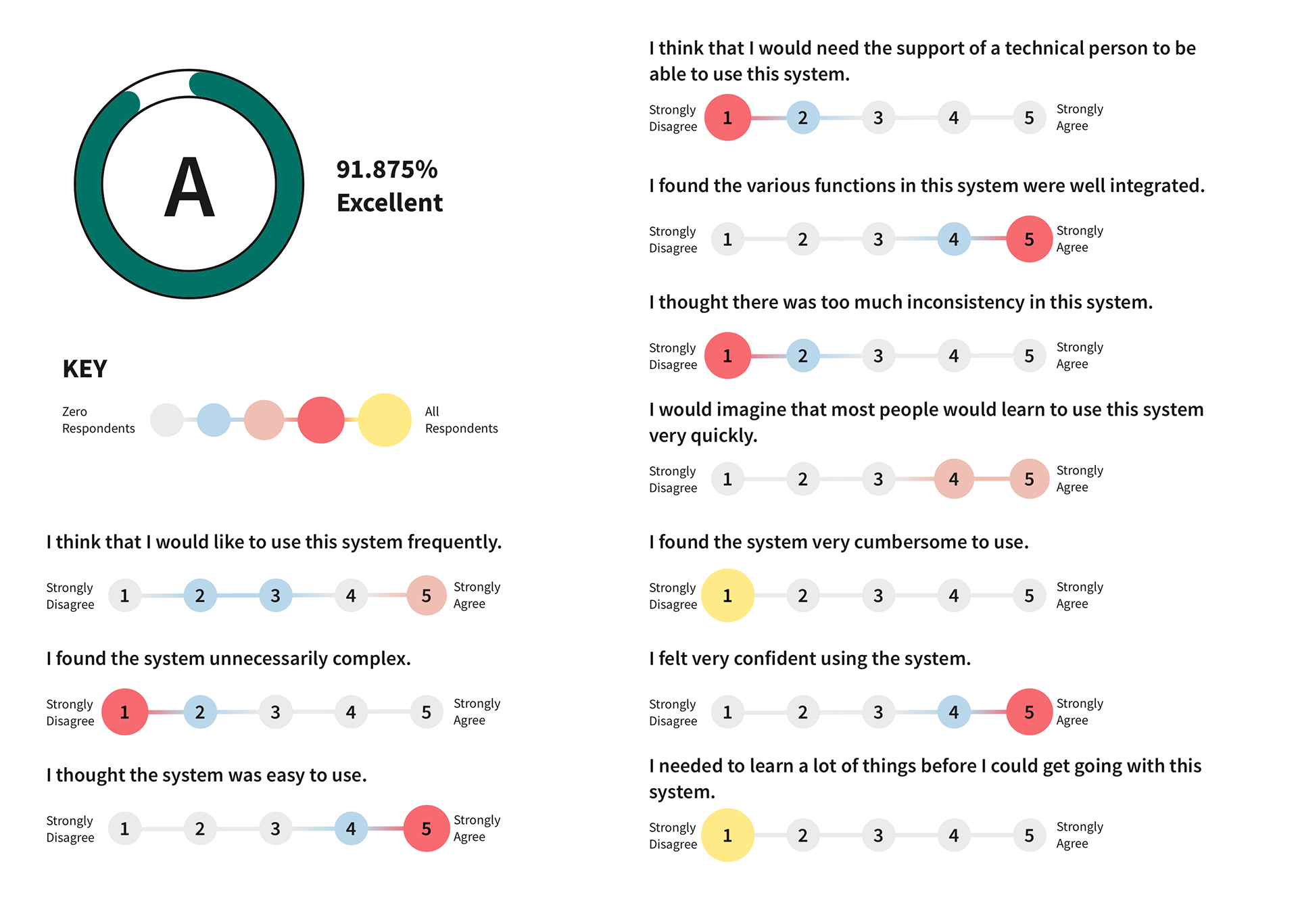
Evaluation
Above is a summary of the SUS scores we received from proxy users. We chose proxy users because we were pressed for time and struggling to conduct remote usability tests with our target audience, but I acknowledge that this is less valuable than testing with actual target users. Overall, we scored very highly on the SUS scale, with participants particularly appreciating the simplicity of our design.
Lessons Learned
I really enjoyed pushing further into the specifics of the visual design—not just border or no border, but how much border and why? I'm very grateful to Andy for guiding me to think through and justify every detail.
I also got some great experience conducting remote user research! Loneliness can be a sensitive topic, and it was a good exercise to develop rapport with each person I interviewed despite only communicating over the phone.
If I were to continue work on this project, my very first action would be to conduct user testing with actual target users. I would also like to further explore the "suggested contacts" and "import contacts" functionalities.