Cover image rendered by Suyash Junnarkar
COLLABR: RE-IMAGINING VIRTUAL COLLABORATION
Spring 2021
Interactive Products Studio with professor Dr. Wei Wang
Created with Suyash Junnarkar
CHALLENGE: Switching to remote work has limited the efficiency of co-working, especially during brainstorming. Can we design an interface that alleviates some of these issues?
MY ROLE: Some initial research, some user research/testing design, and some UX design. Iconography development and video planning and editing.
Tools and techniques used include surveys, interviews, data visualization, visual design language definition, iconography design in Sketch, interface design in Figma, and video editing in Adobe Premiere Pro.
Understanding the problem
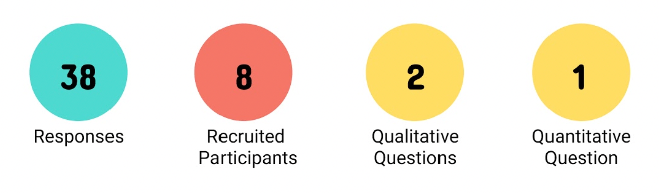
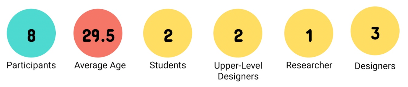
We started with a survey with 3 objectives:
1. Understand tools currently being used
2. Get a brief overview of current pain points
3. Recruit participants for interviews
With our recruited participants, we started interviews, keeping these goals in mind:
1. Understand how remote collaboration has changed during lockdown
2. Identify successful and unsuccessful aspects of remote and in-person collaboration
3. Learn about any DIY fixes users have implemented
4. Learn about the tools that our participants have on hand
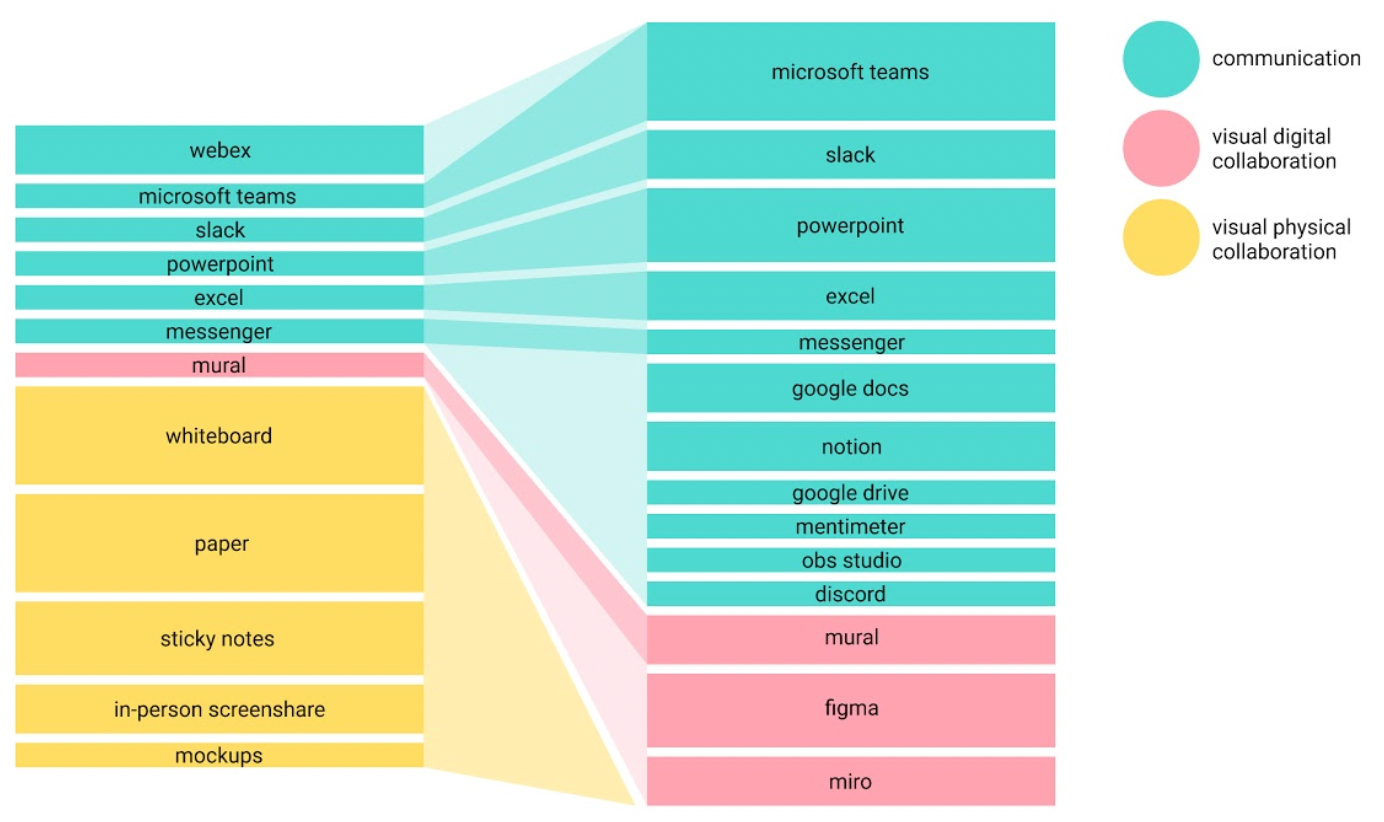
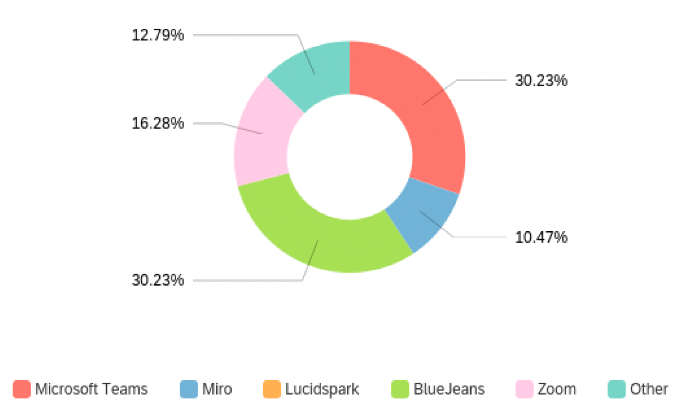
This shows the tools used before and during lockdown.
Interviewees explained that they missed the tangible aspects of collaborating in person. They also described managers' resistance to new software, insisting that the status quo is good enough to avoid learning a new system.
Identifying a Solution
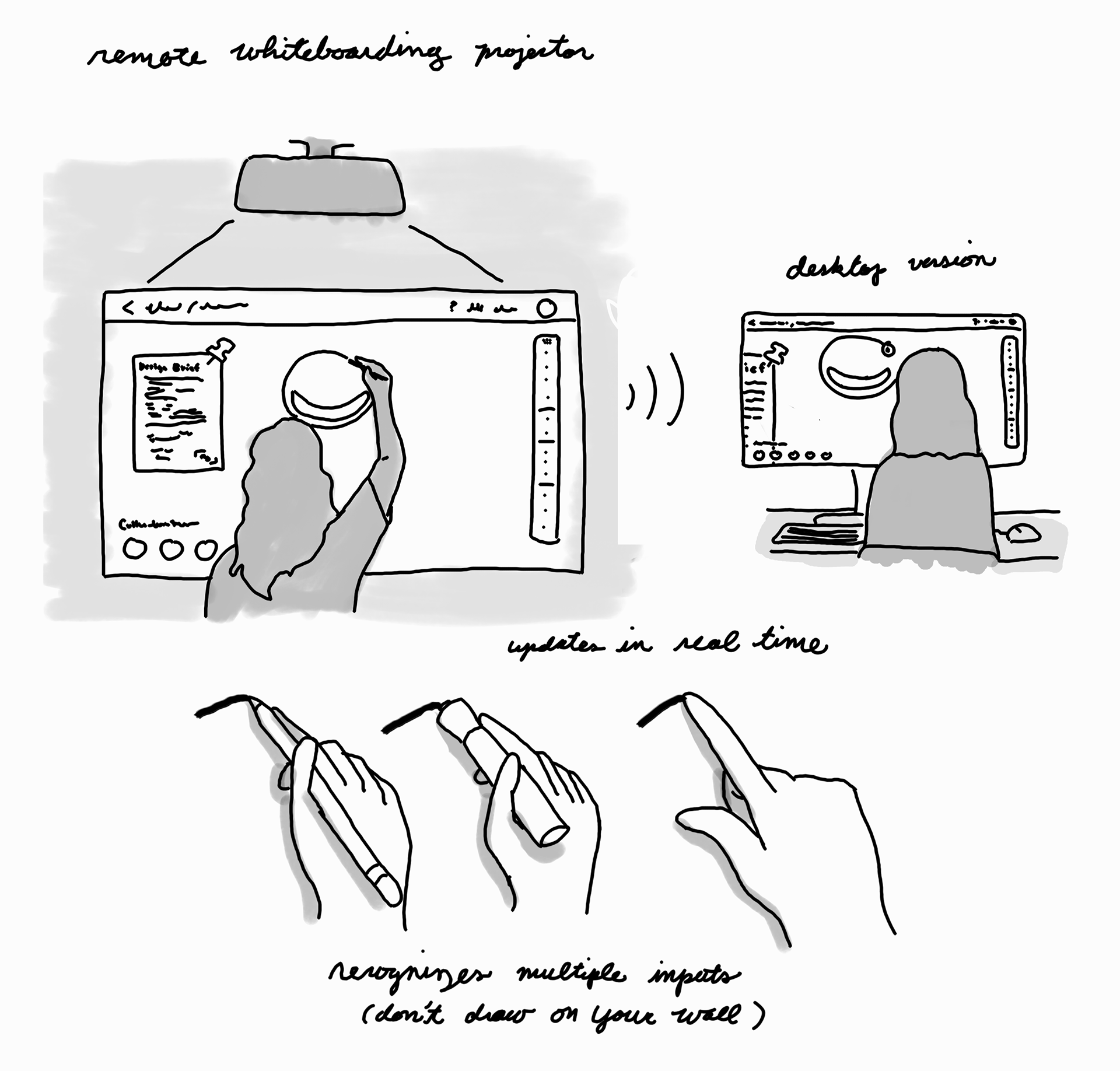
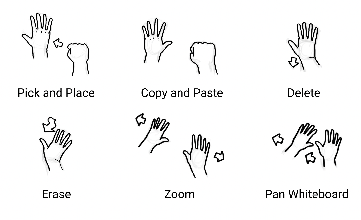
Based on the interviews, we chose a direction that incorporated:
1. "Tangible" interactions to substitute for missing tools like post-its and push pins
2. Large-scale display or interaction environment, like a pin-up board
3. A desktop version for people who don't want/can't get the fancy technology
4. Known metaphors and information architecture with clear organization
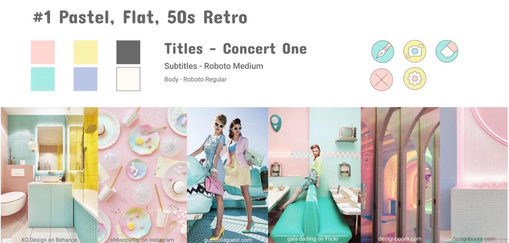
Retro: cute and trendy
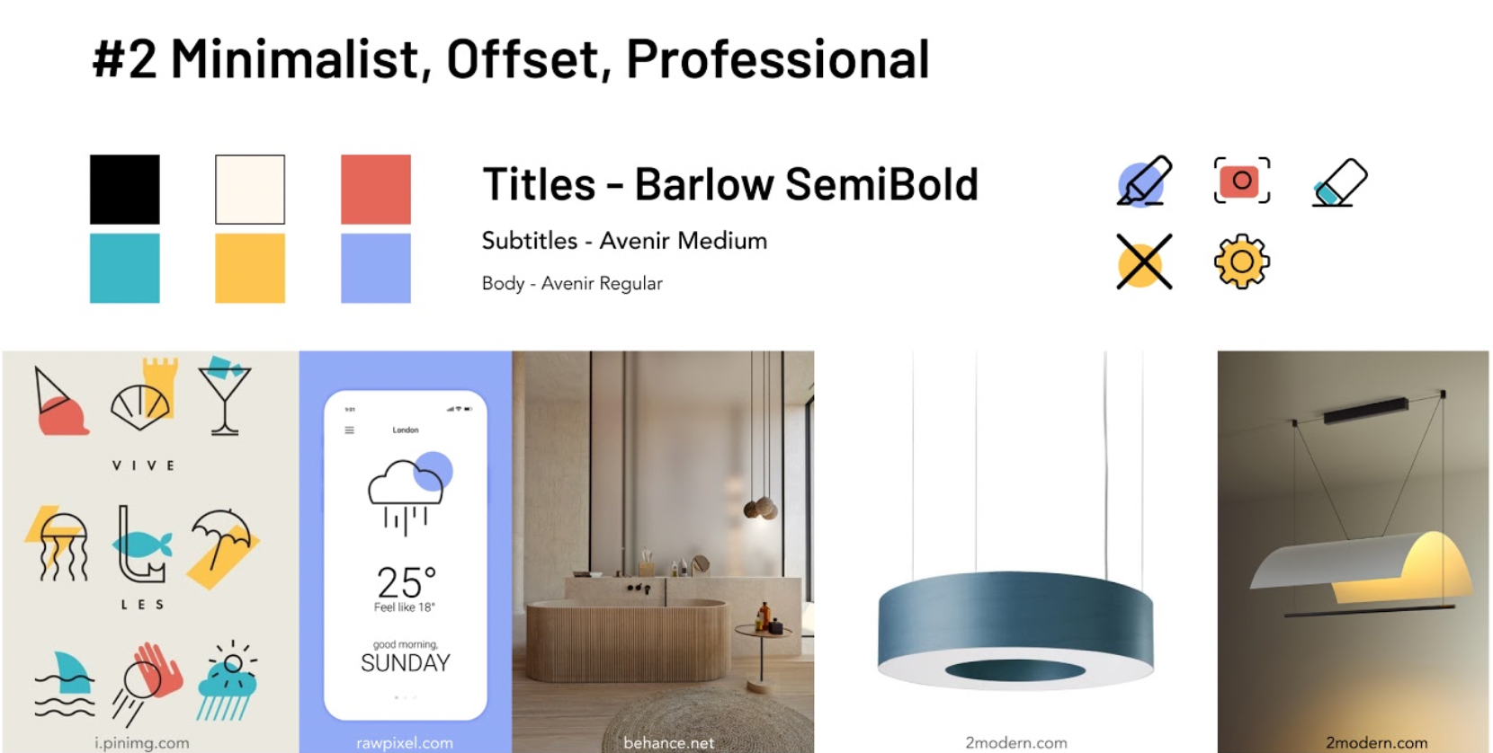
Professional: fits our target users
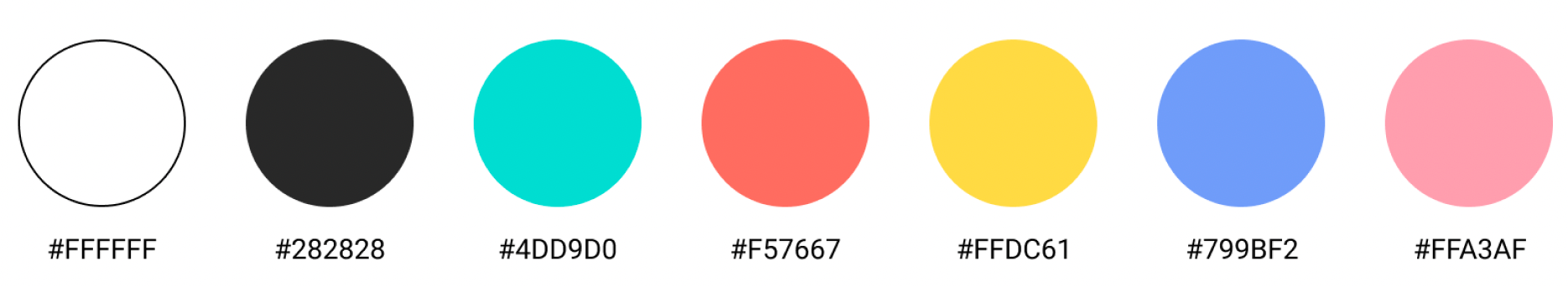
Colors from #2 but brighter and more saturated to show up better when projected
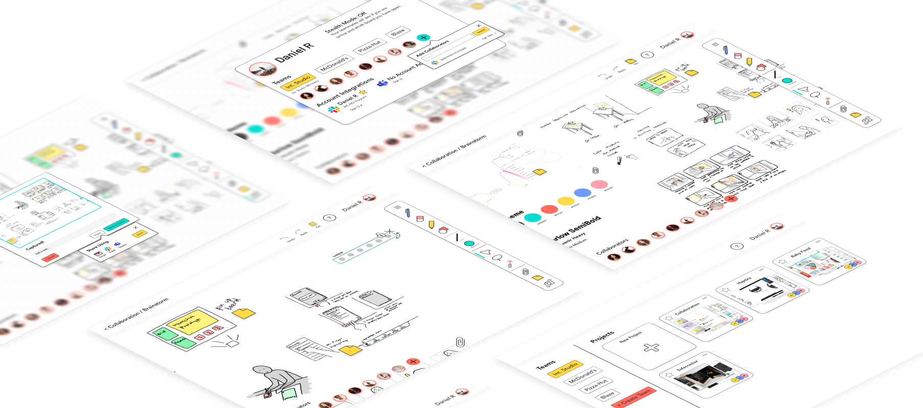
CollabR

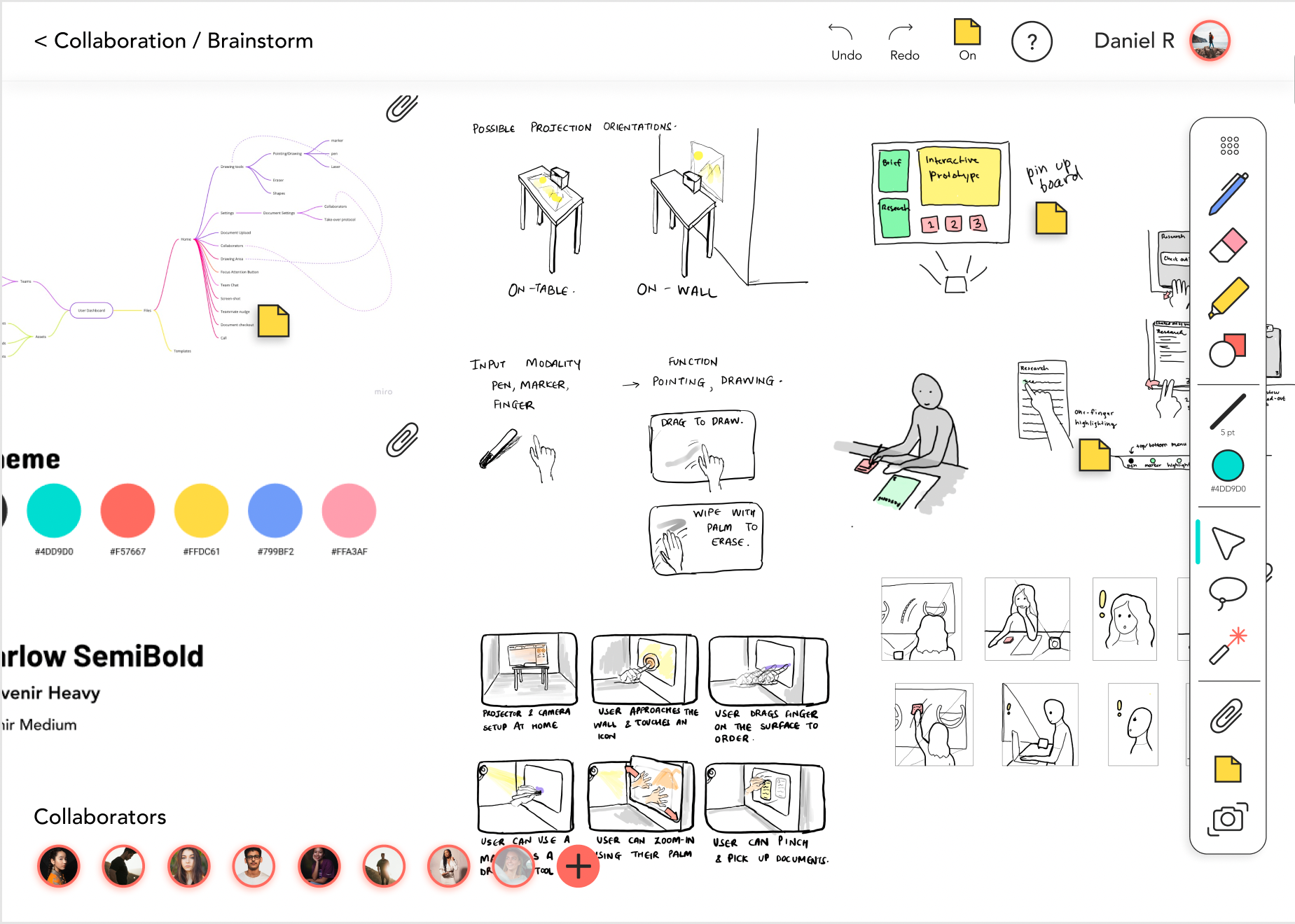
Explore our prototype here: https://www.figma.com/proto/RfqWqzfshVe3WH5BnY1Oni/P2?node-id=297%3A6652&scaling=min-zoom&page-id=297%3A6651
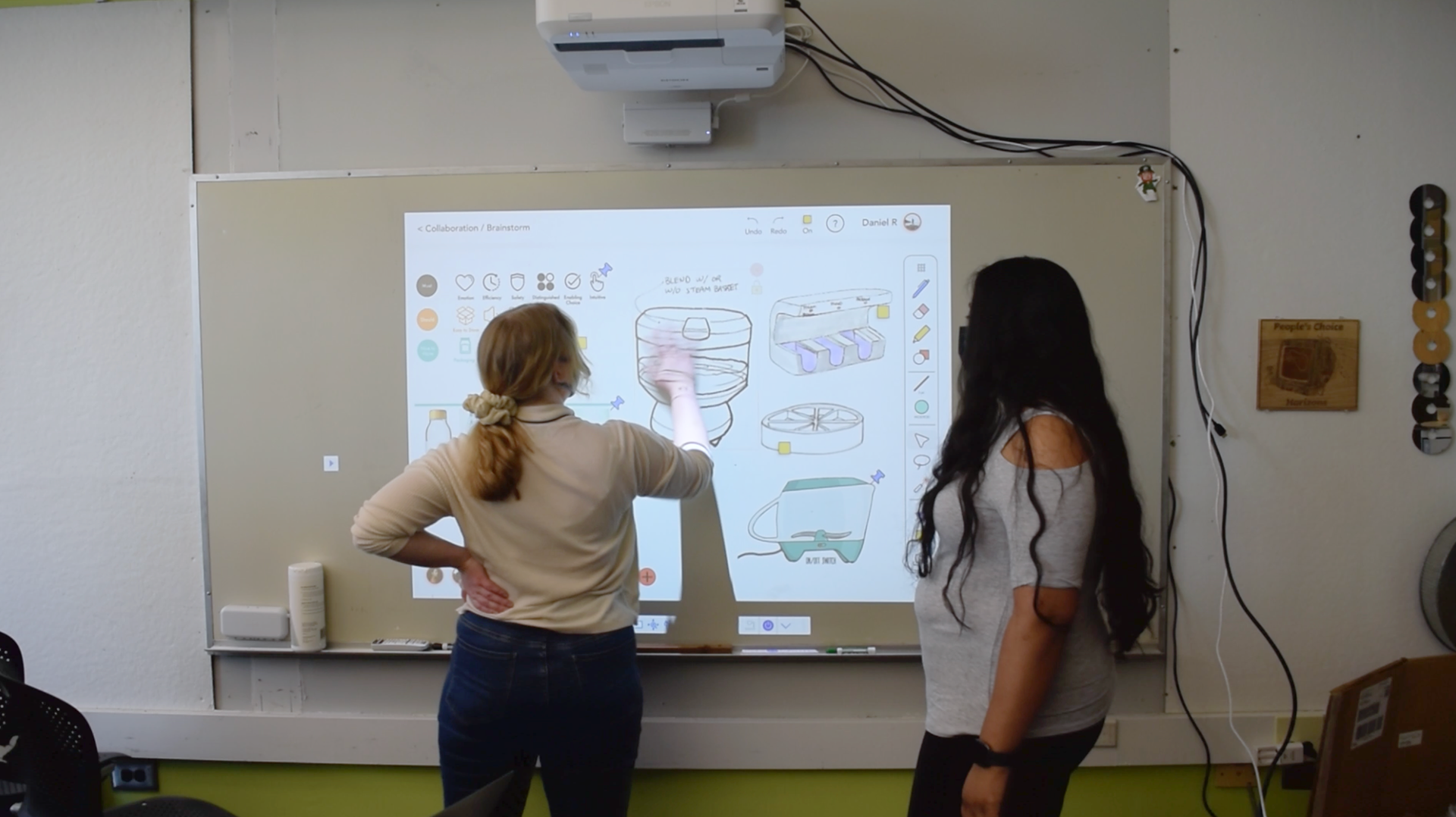
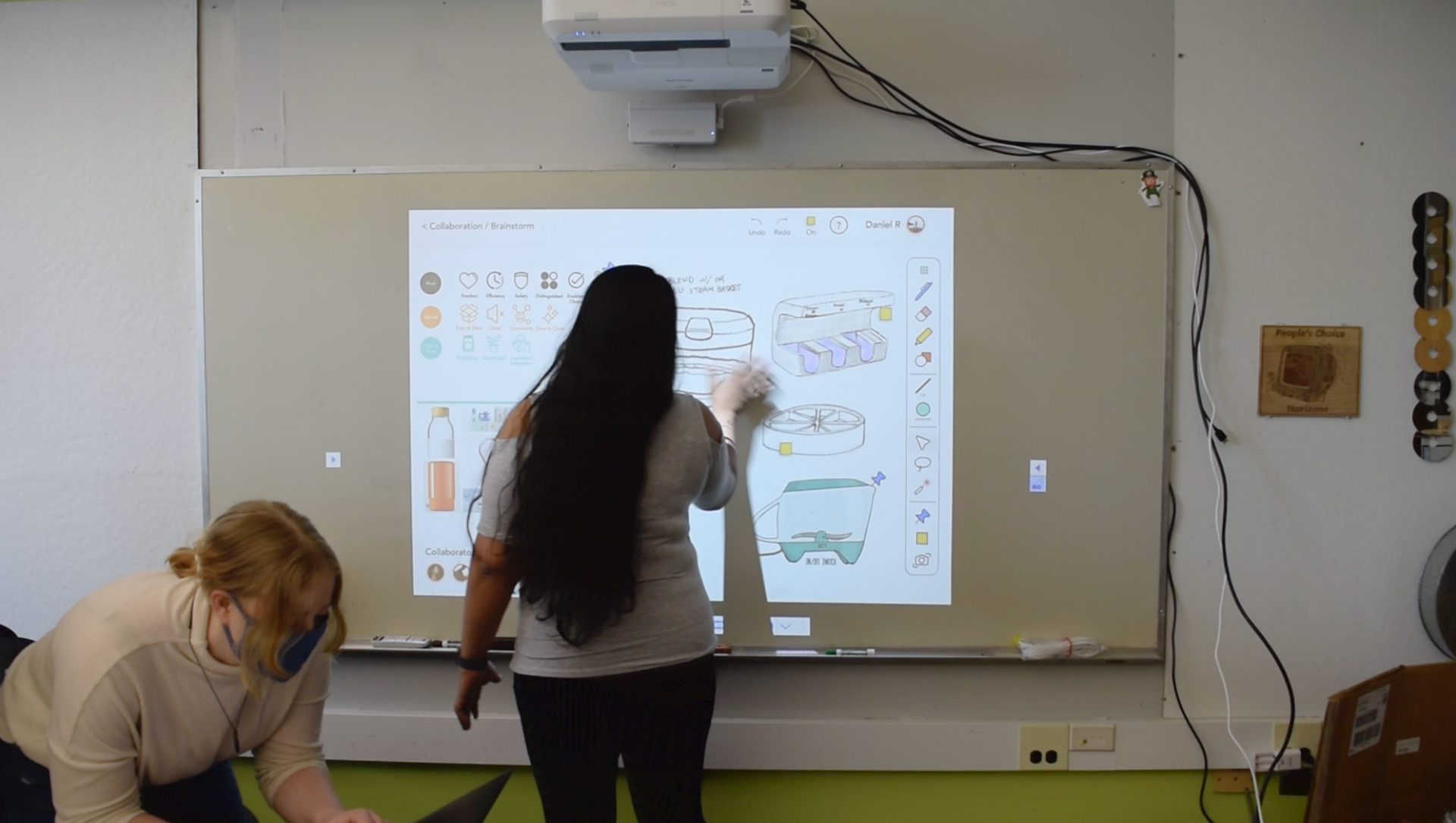
Evaluating with Users
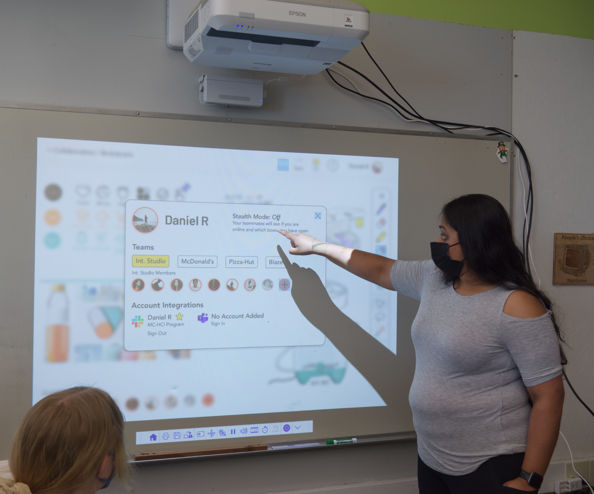
point out specifics
demonstrating a gesture
and the participant repeats it

We used contextual inquiry, bodystorming, and a semi-structured interview to evaluate our UI, information architecture, and features.
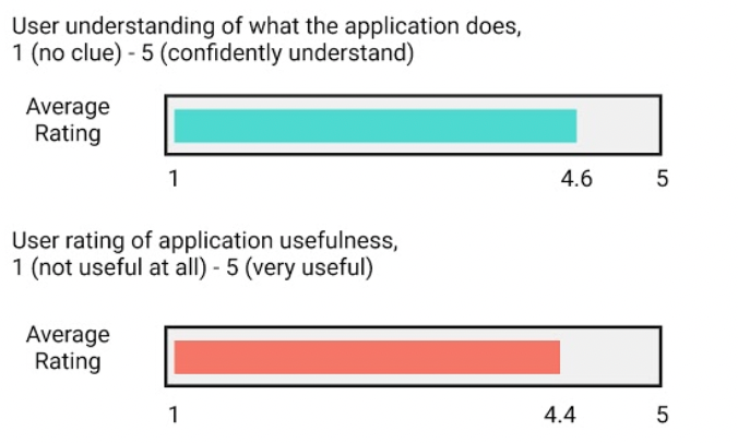
Our feedback fits into three categories.
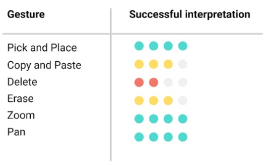
User interface: Various icons were confusing, the indicator for an active tool wasn't visible enough, and the "delete" gesture wasn't intuitive. Other gestures made great sense, and a brief tutorial could resolve many issues.
Information architecture: Some things just weren't thought out—where do screenshots go? Users were big fans of our project-level Assets.
Features: some features weren't thought through and need refinement. Also, word choices for "nudge" (start a private conversation) and "focus" (essentially screenshare) were confusing.
Lessons Learned
Color can be tricky to use. Gesture interfaces are fun and easy when you get the gestures right, but anything that isn't intuitive or familiar will be difficult to learn and may not get used.