NOMI: BABY FOOD MAKER
Summer 2018 - 10 Weeks
Vertical Studio with professor Kevin Shankwiler
Created with Cameron Chartier, Jordan Cutsuries, Abigail Maeder, and Rebecca Nicoara
CHALLENGE: Design a powered tool or appliance specifically for the developing realm of e-commerce. Find out what makes a product successful online and push that through all levels of the design process from market research to brand presentation.
MY ROLE: Background research on e-commerce, online purchasing decisions, and baby food choices. Investigation of "subtle cuteness" & its application to our design including concept generation. Exploration & refinement of packaging solutions.
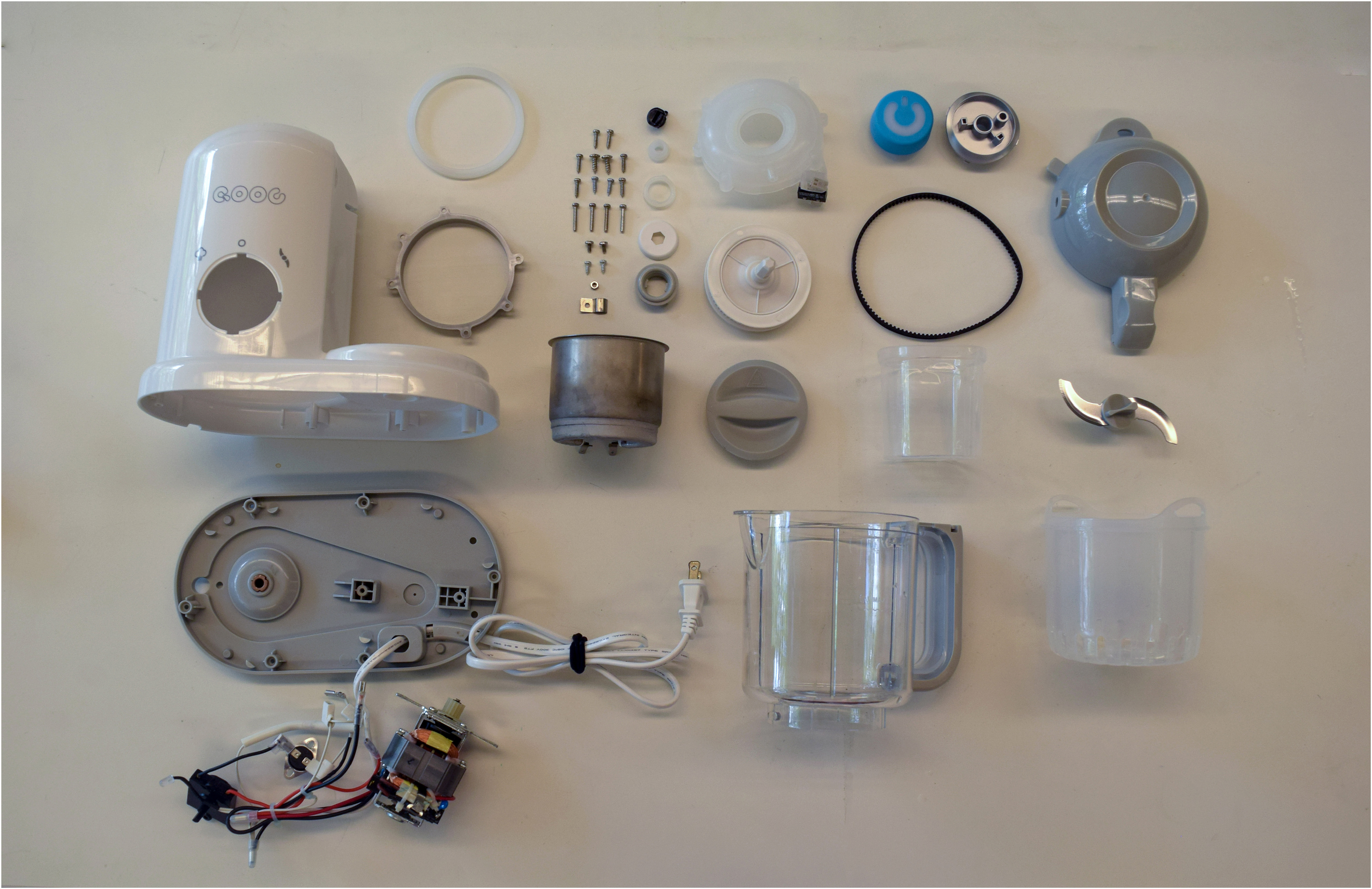
Tools and techniques used include information visualization in Illustrator, benchmarking via dissection, sketch-based iteration, vector graphics in Sketch, and rapid packaging prototyping.
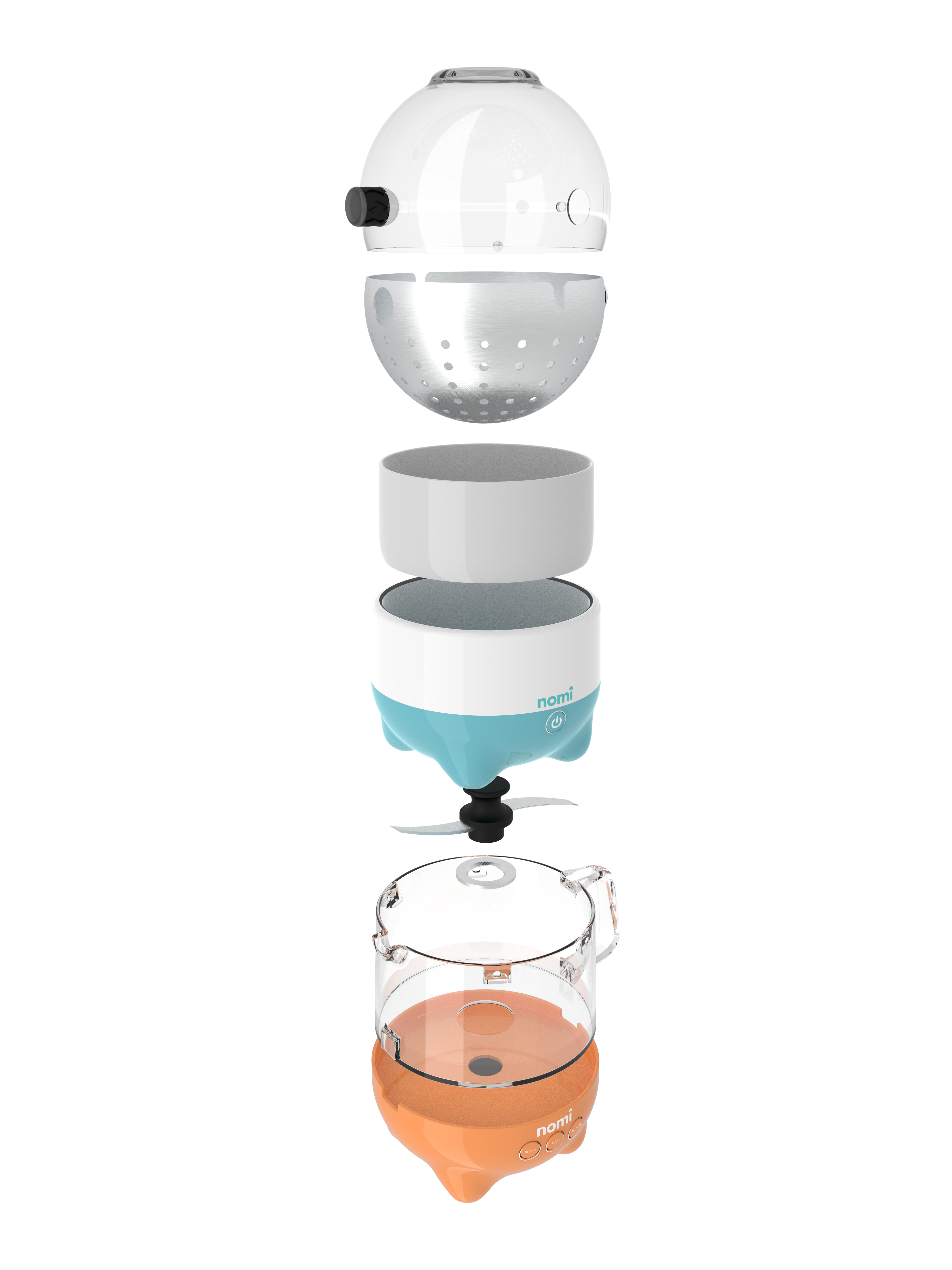
Renders by Jordan Cutsuries
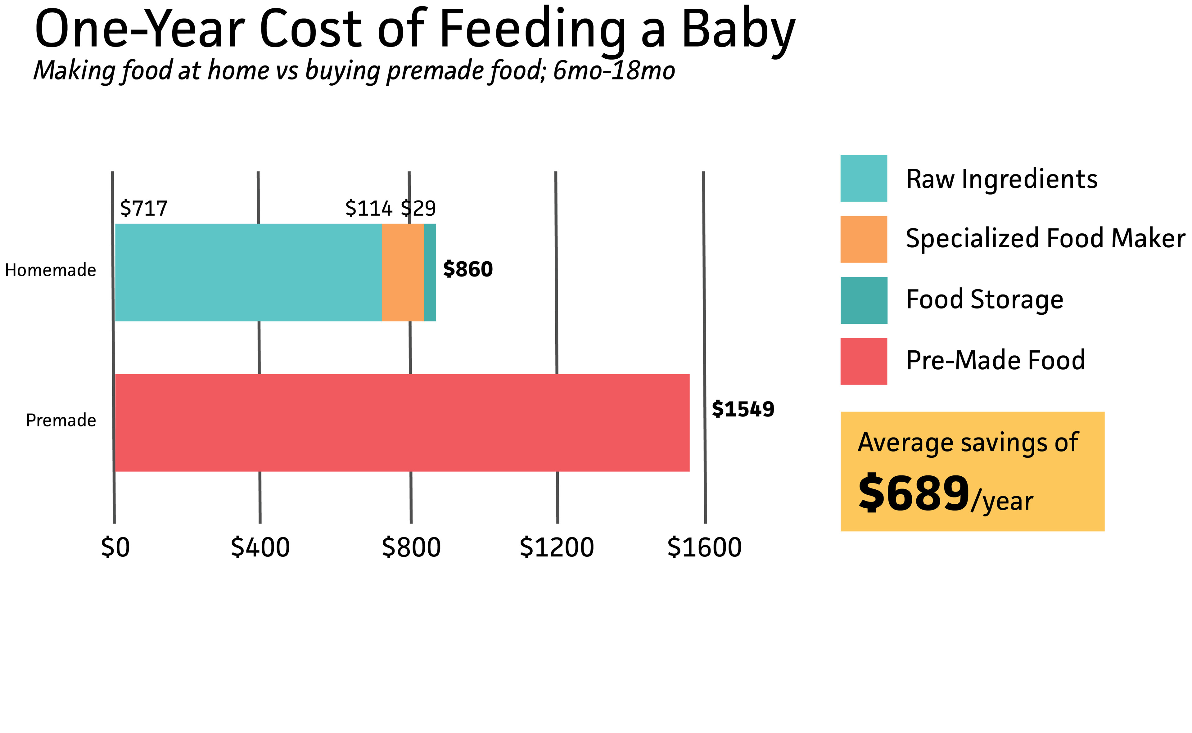
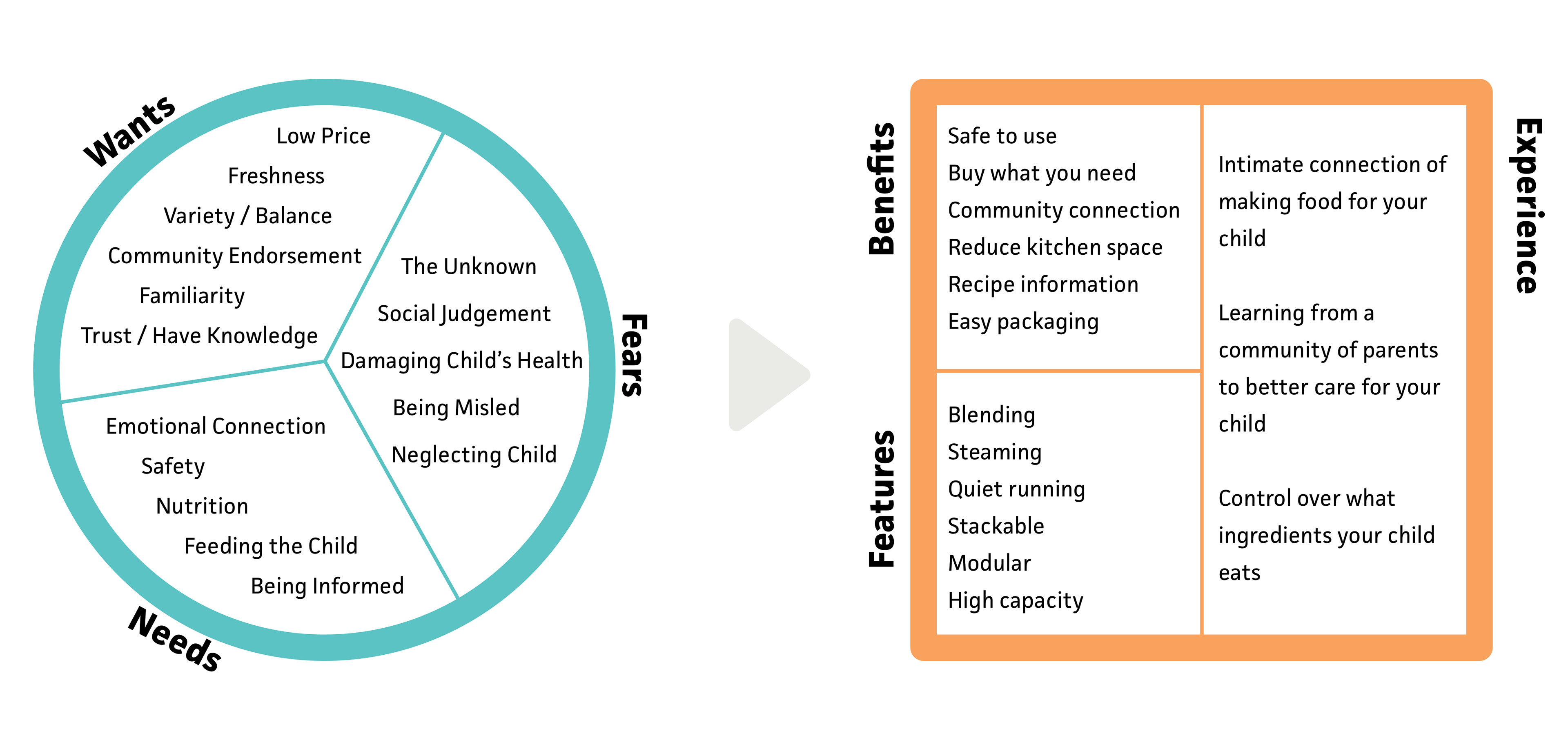
Why do parents make their own baby food?
From our survey and interviews, we learned that one major reason is control. Parents don't trust processed food, and making it themselves allows them to know exactly what they're feeding their baby. In user interviews, one phrase we heard the most was that parents make baby food themselves "to know what's in it."
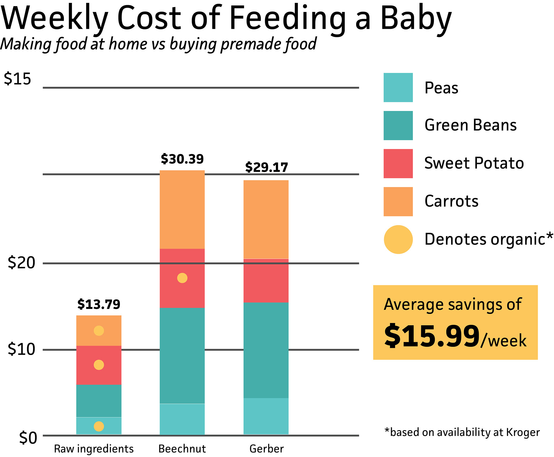
It's also a lot cheaper to make your own baby food instead of buying it from the store, even if you buy a specialty baby food appliance.
Our product has to speak to these needs: it must be transparent and at a low price point.
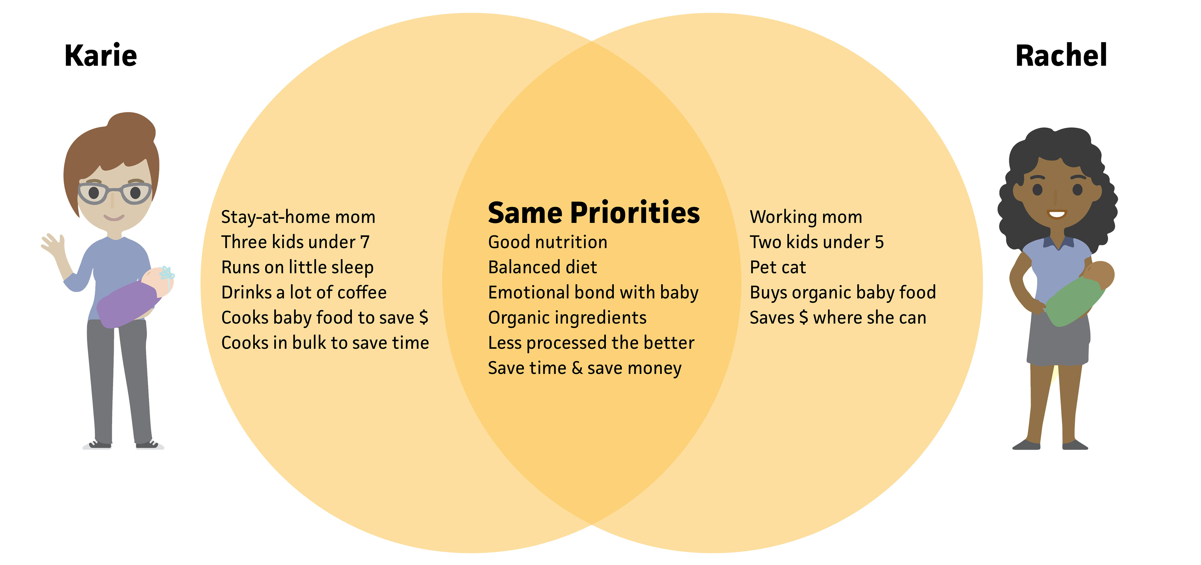
Our two target personas. Karie is a stay-at-home mom who uses what she already has to make baby food. Rachel is a working mom who buys premade baby food. What's important is that these women have many of the same priorities.
Why use a specialty appliance vs DIY?
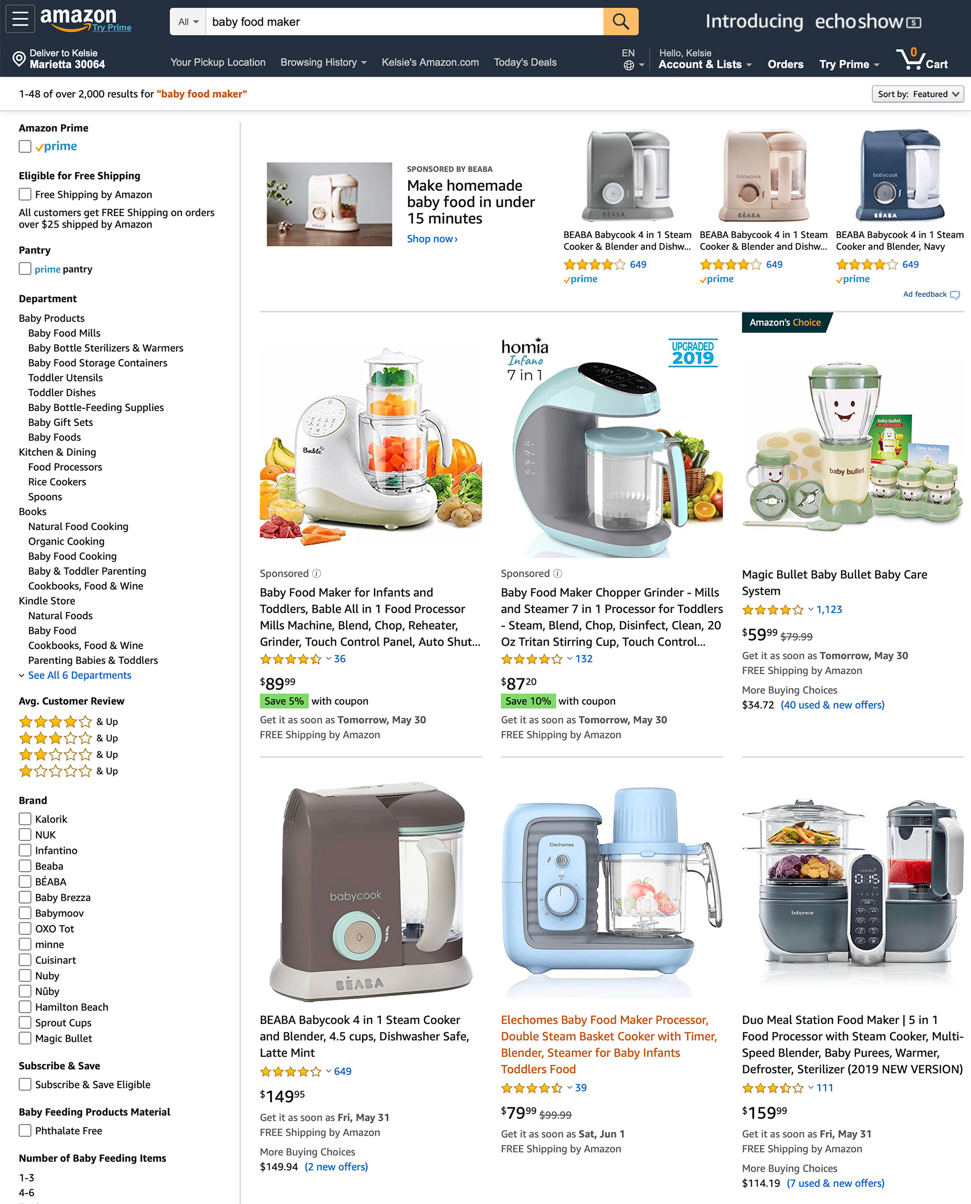
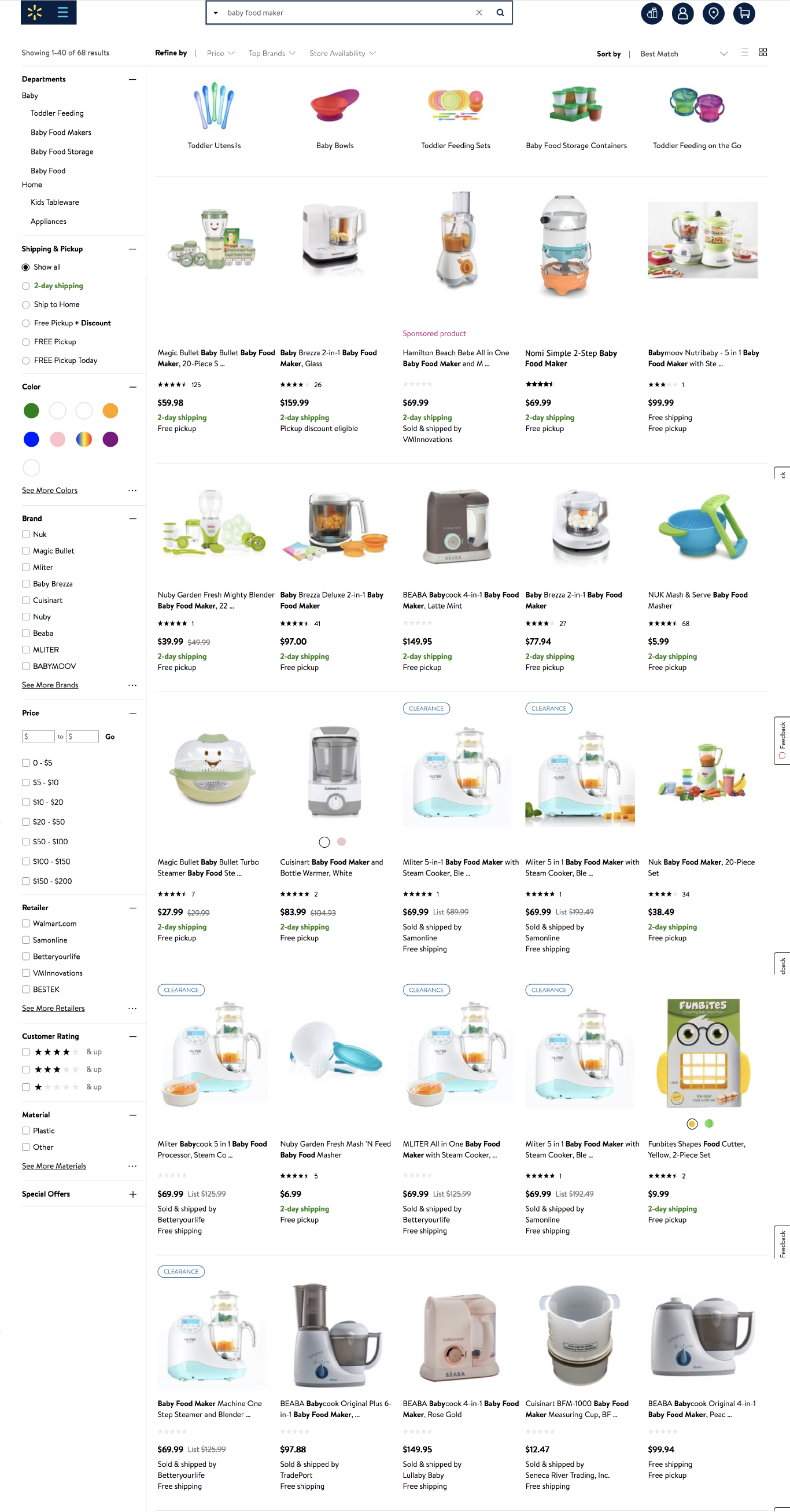
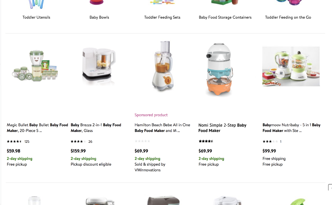
There are actually a lot of options for baby food makers, but many of the parents we surveyed said they didn't use specialty products. Why not? Well, it might be the names: see the search result on the top right, the "baby bullet."
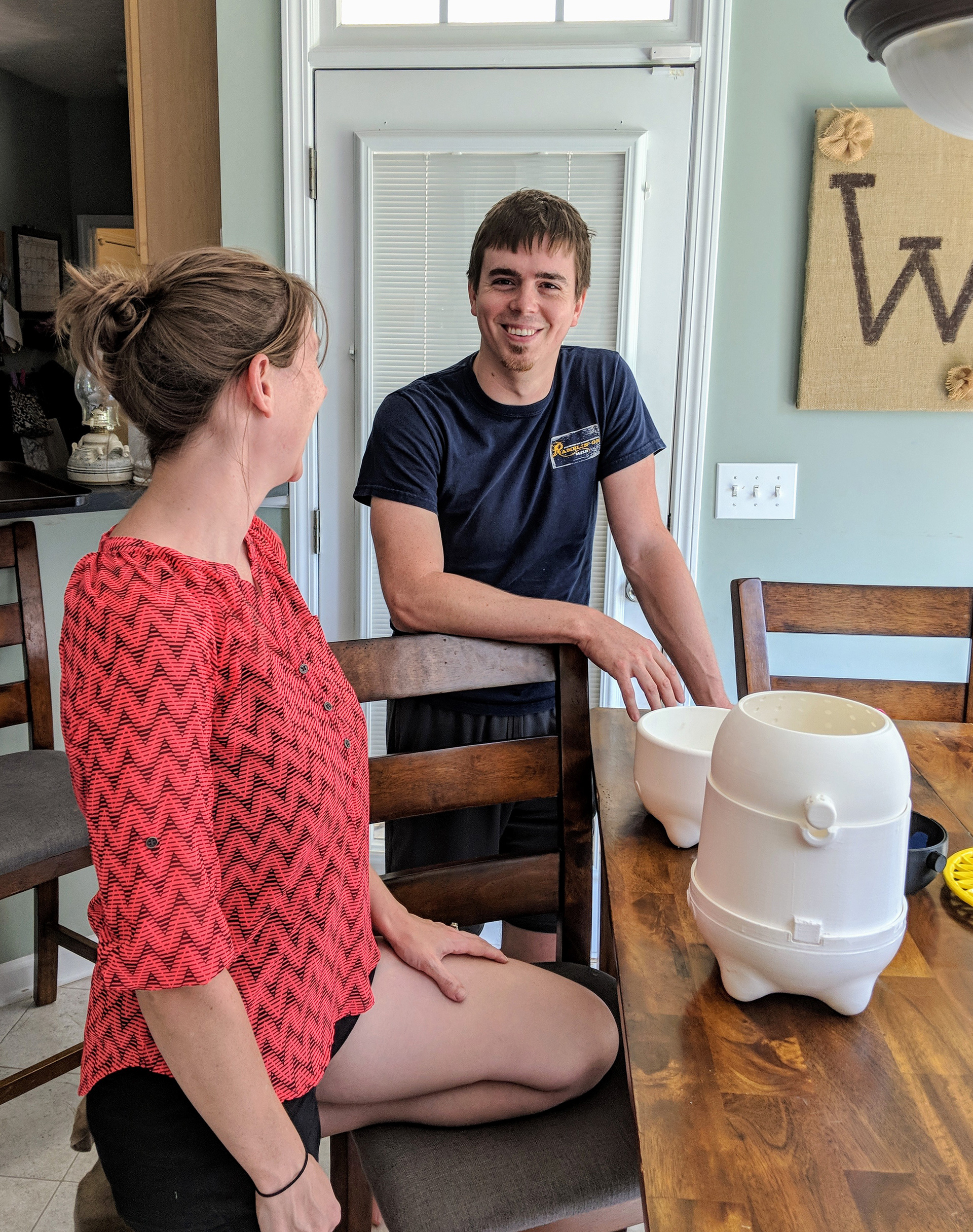
Another clue is in the products' capacity. Many have a very small capacity, yet a majority of the moms we surveyed say they make an entire week's worth of food at once. Machines that can only make one or two servings at a time just don't cut it.

Photos by Rebecca Nicoara
Making baby food using non-specialized tools also allows parents to feel more directly involved in the process: making food for your baby is an act of love, and there's a stronger emotional connection when you aren't just pushing a button.
For us, this means that our product must have a larger capacity than other baby food makers, and must find a way to maintain that emotional connection.
How can a product stand out online?
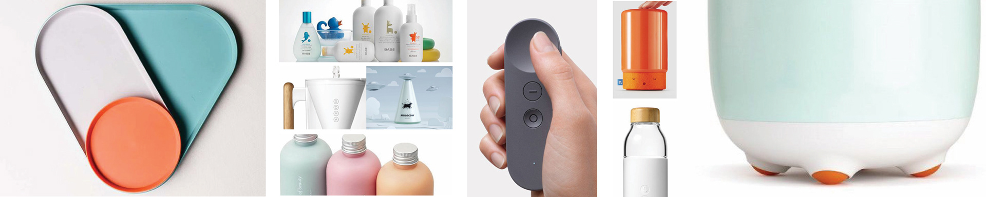
Successful e-commerce models capitalize on product differentiation and custom purchasing options. We want our product to be visually different from other baby food products, and we want it to be modular so that we can offer multiple purchasing options for moms with different needs.
One way for us to stand out is to find a more subtle take on the "baby product" look. Many products on the market make use of the typical baby pink and blue color scheme, and some use actual faces to anthropomorphize their products. But could we convey this differently?
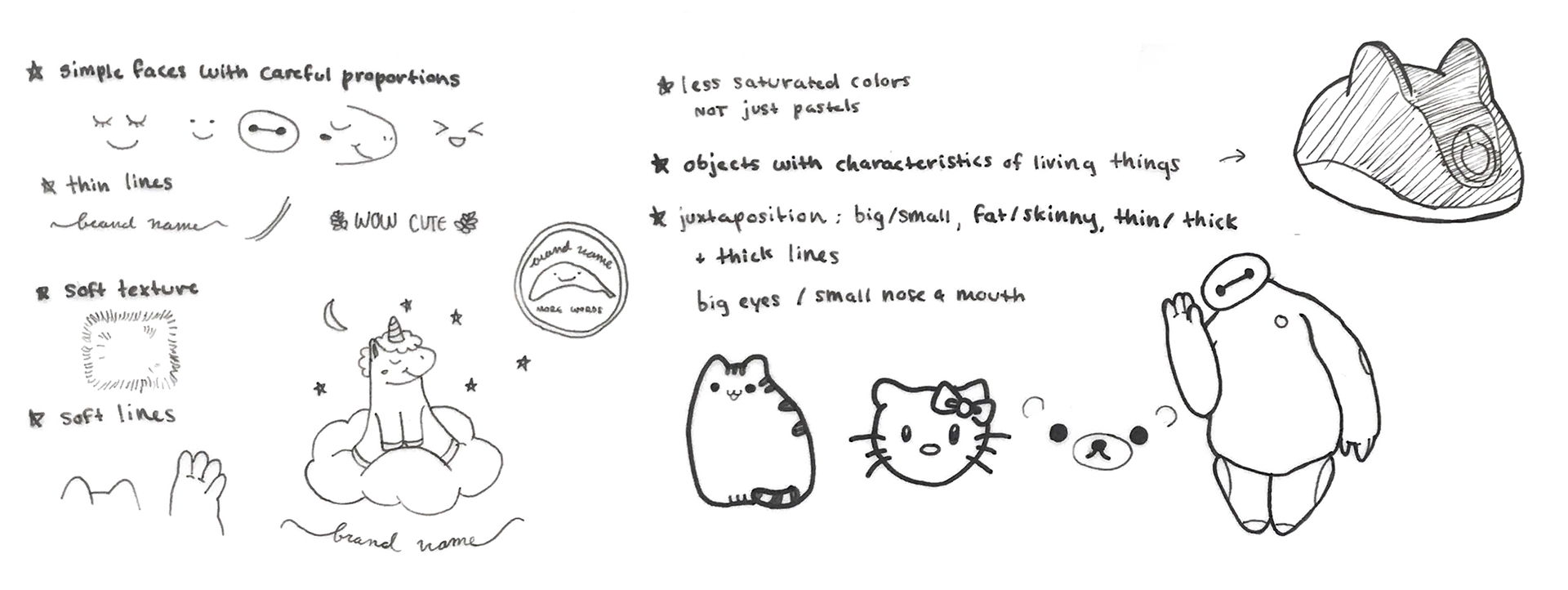
What makes something cute?
playful • soft • peaceful • safe • simple
To start us off in the right direction, we compiled a moodboard based on a "subtle cute" and words we saw often in our survey and interviews. Then I moved into a further exploration of cuteness.
What does our baby food maker need to do?
MUST ADDRESS: emotion, efficiency, safety, distinguishing, enabling choice, intuitive
SHOULD ADDRESS: easy to store, quiet, community, easy to clean
COULD ADDRESS: packaging, sustainability, ingredient sourcing
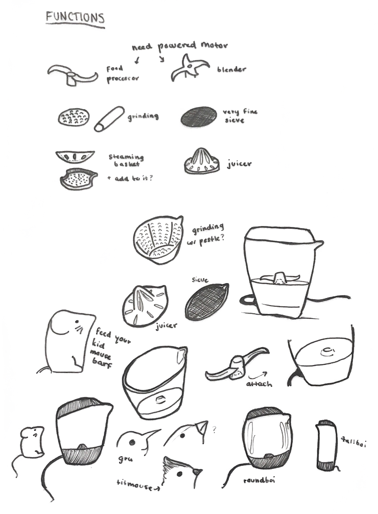
what functions should the product have?
how can it be cute?
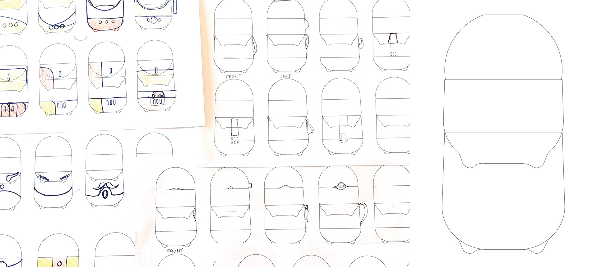
first form idea
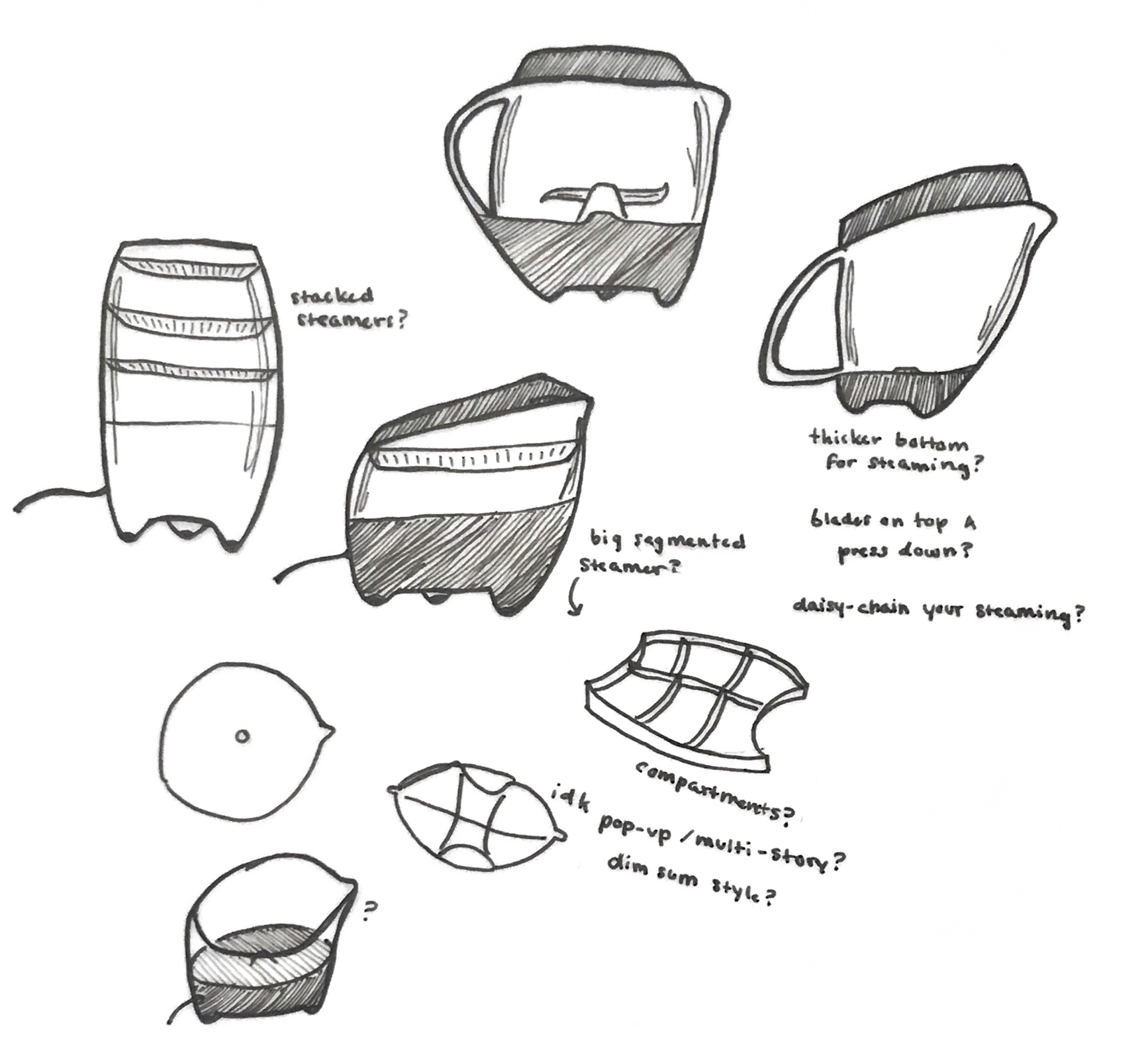
steamer specifics

narrowing down the functions
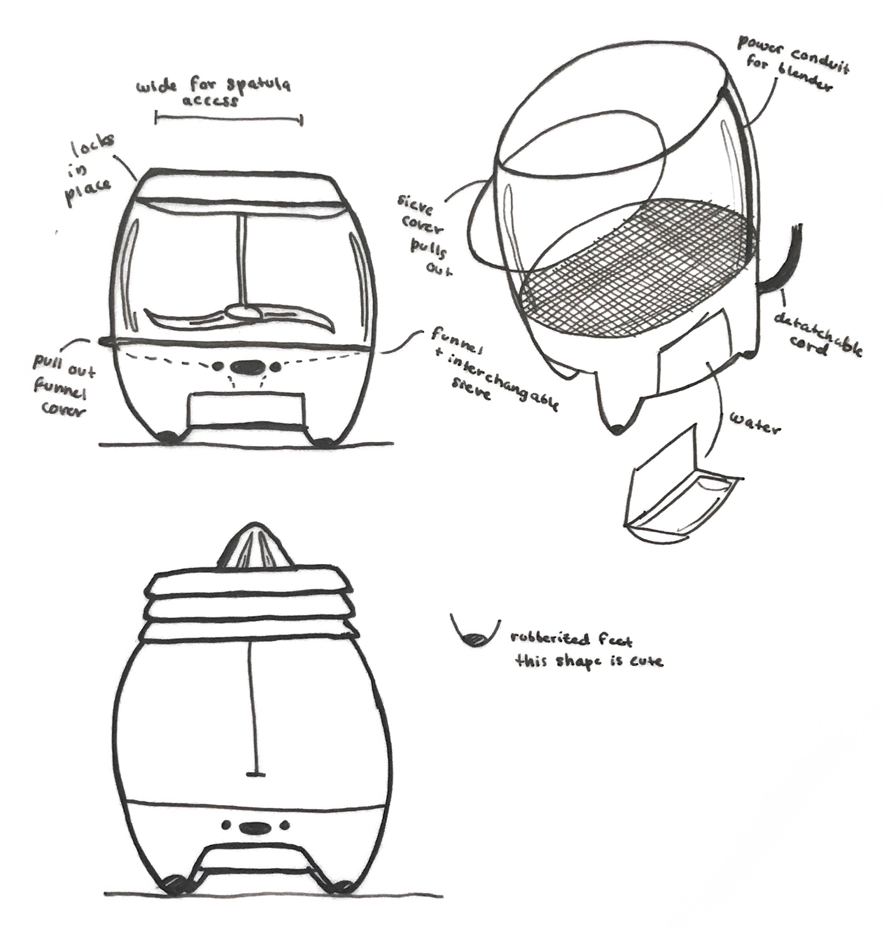
power and storage
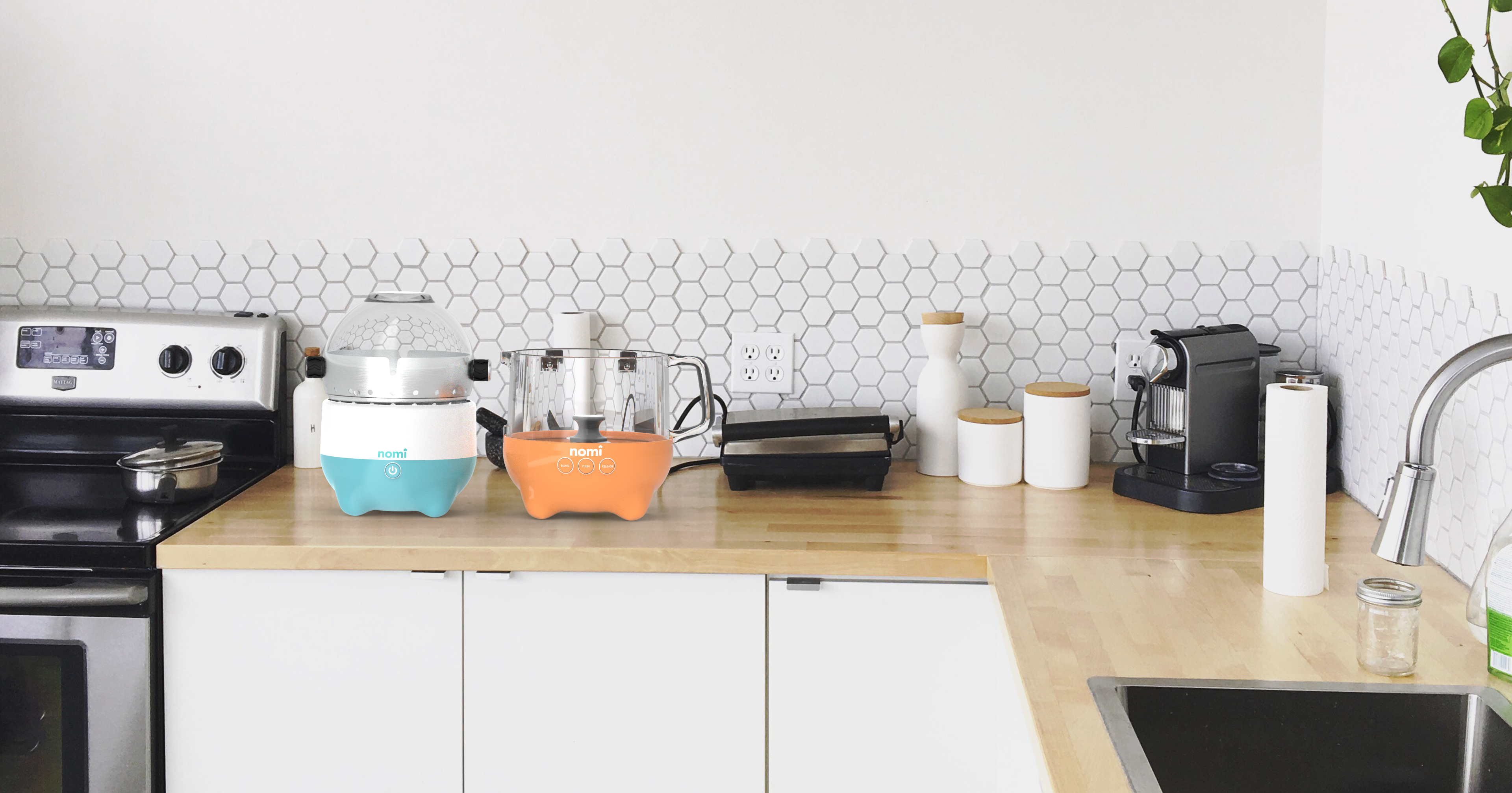
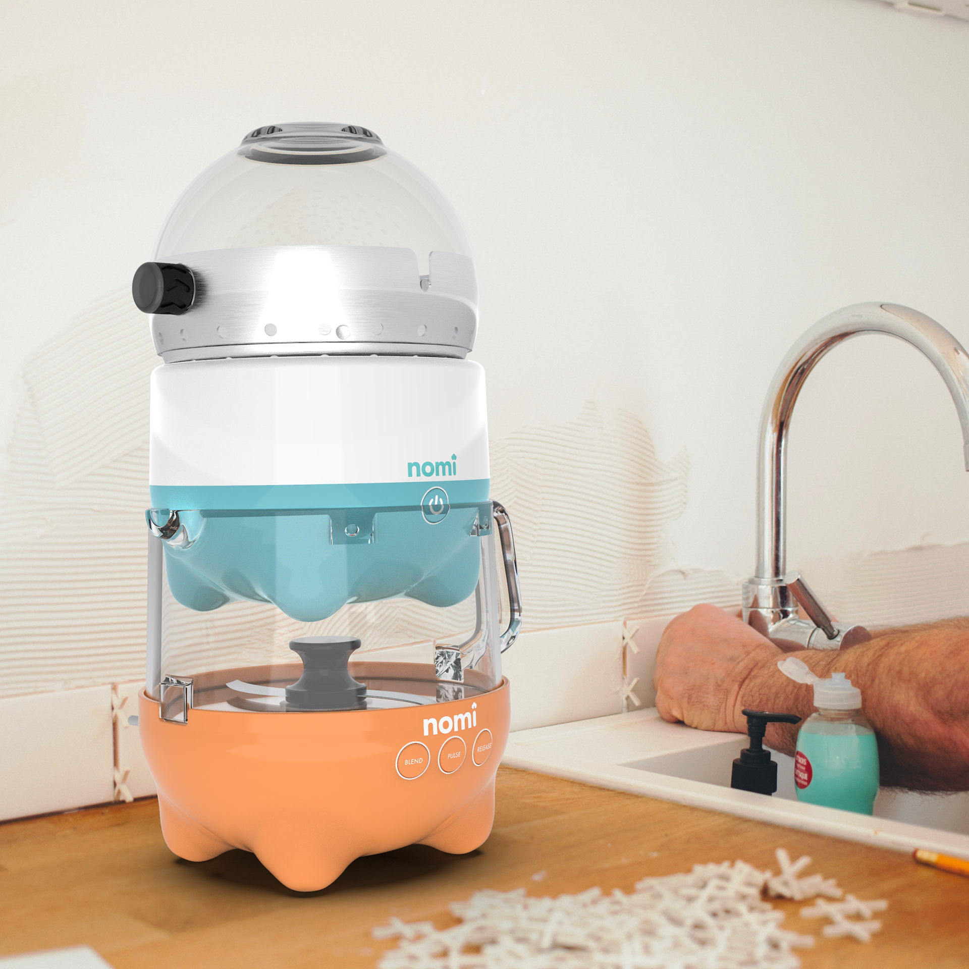
in use
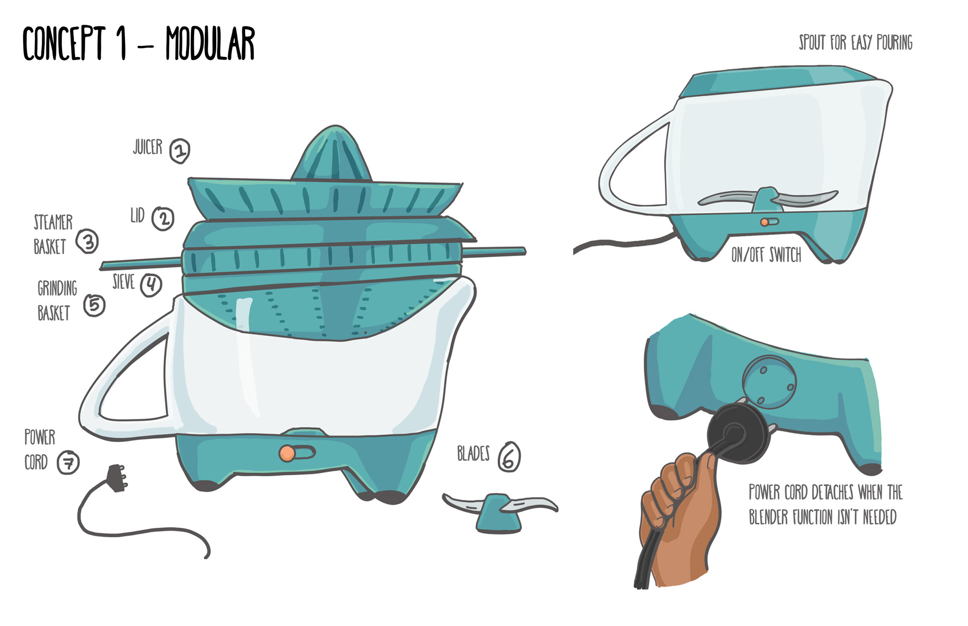
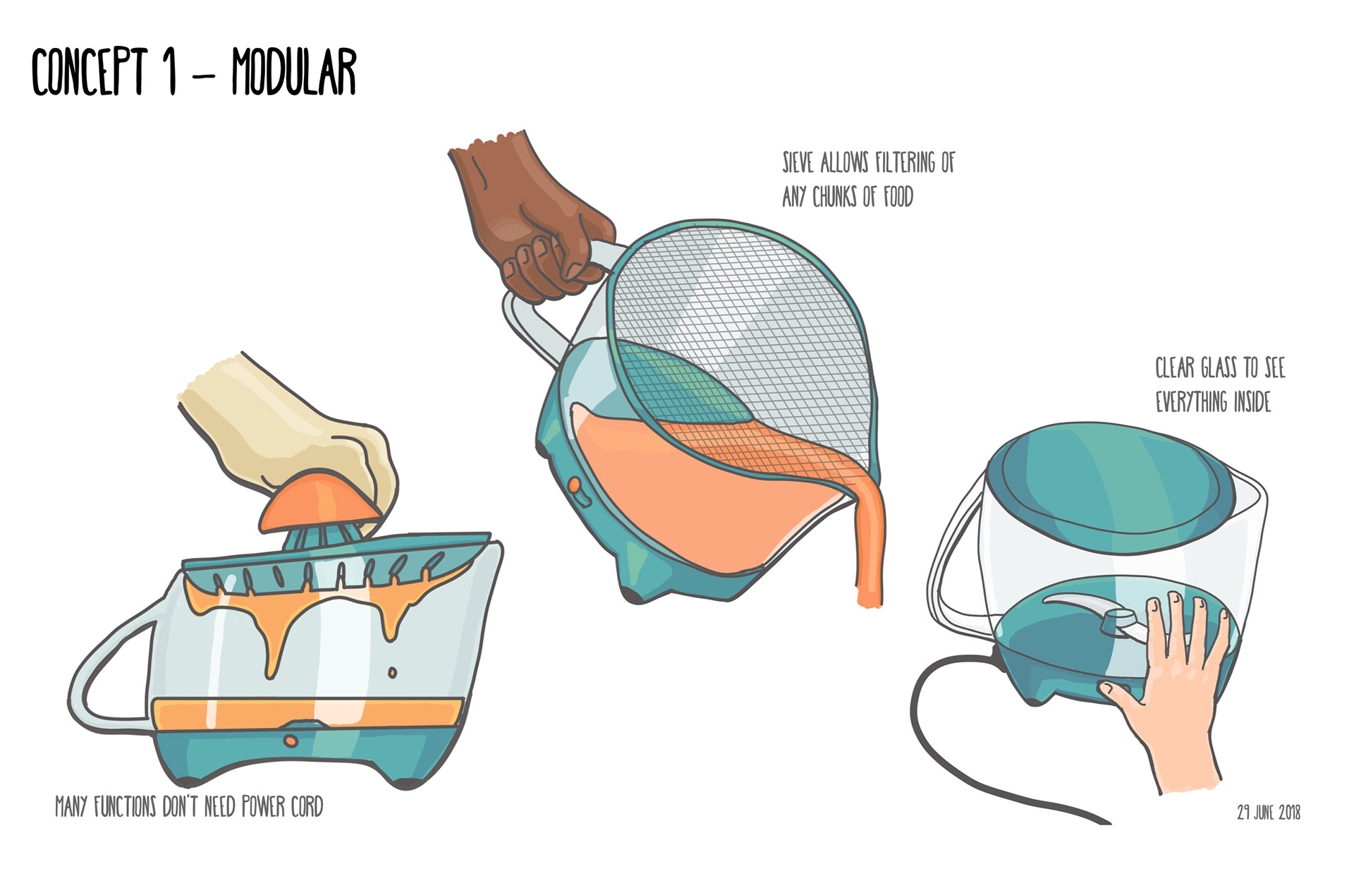
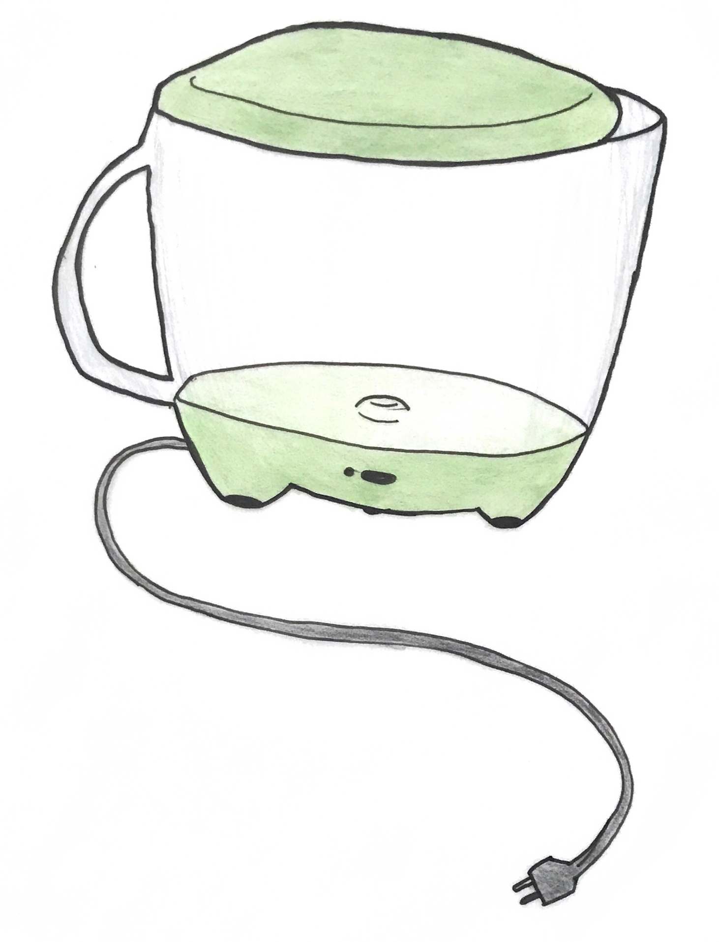
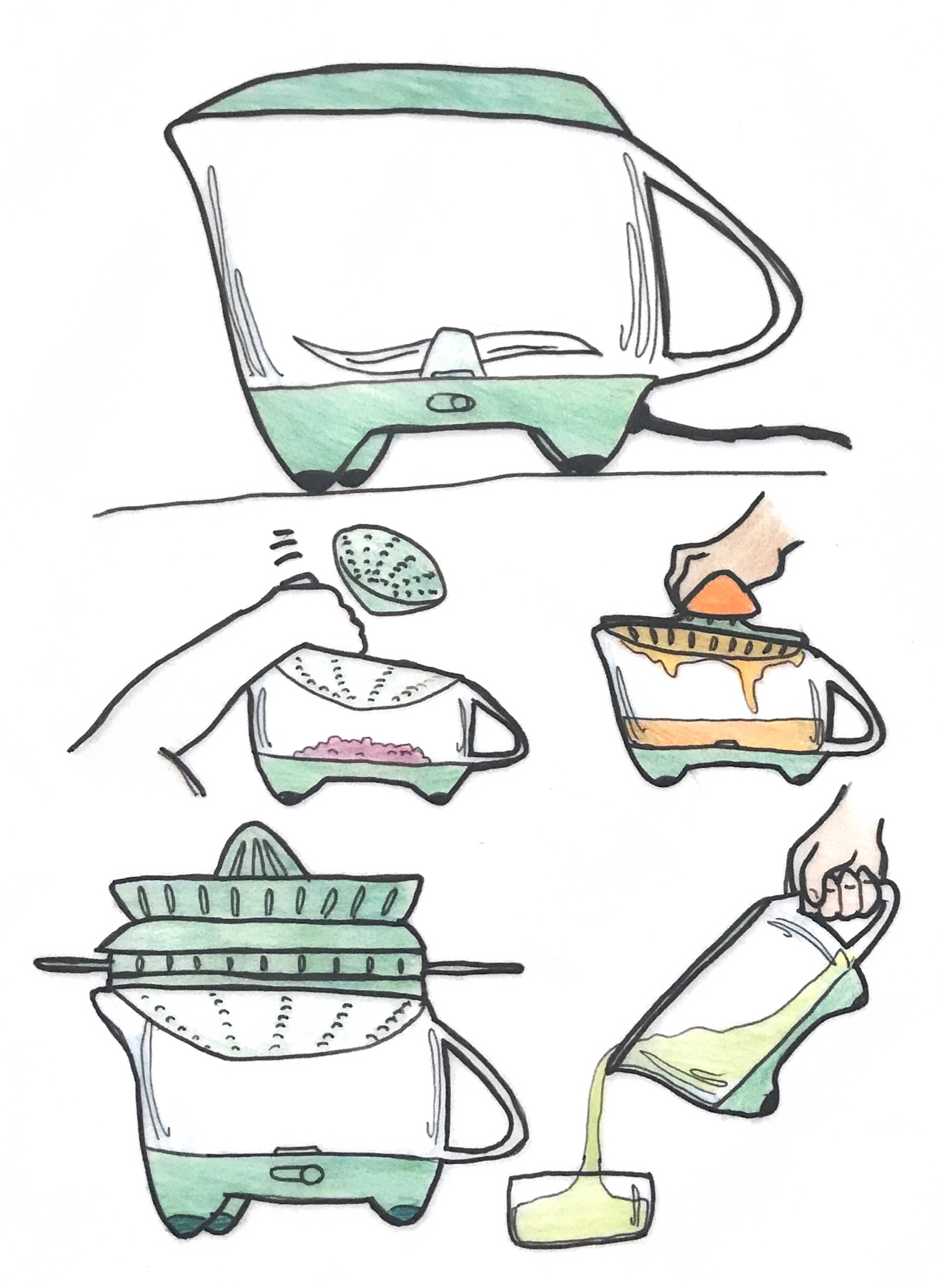
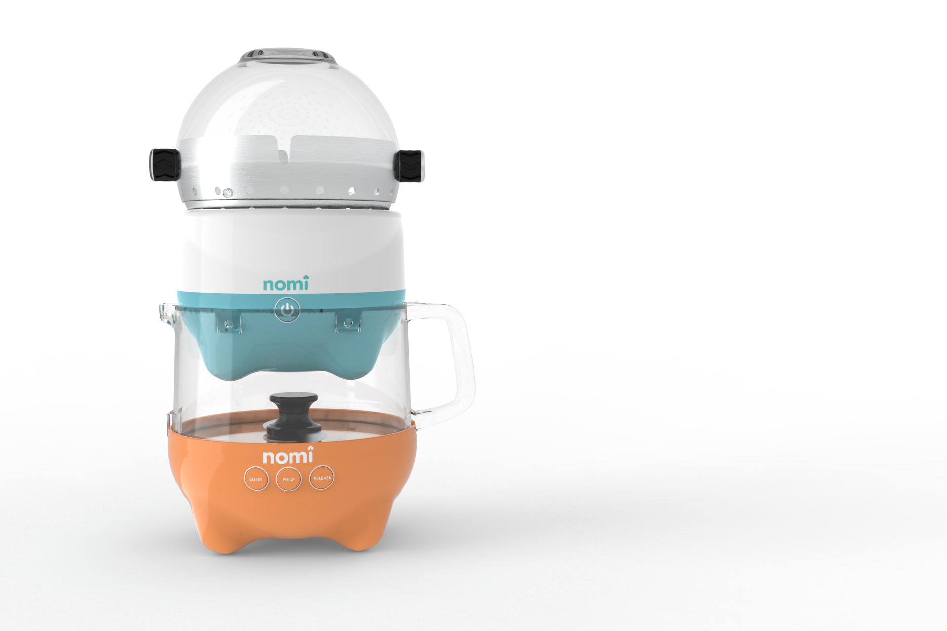
My concept focused on modularity and customization; parents could order only the components that they needed.
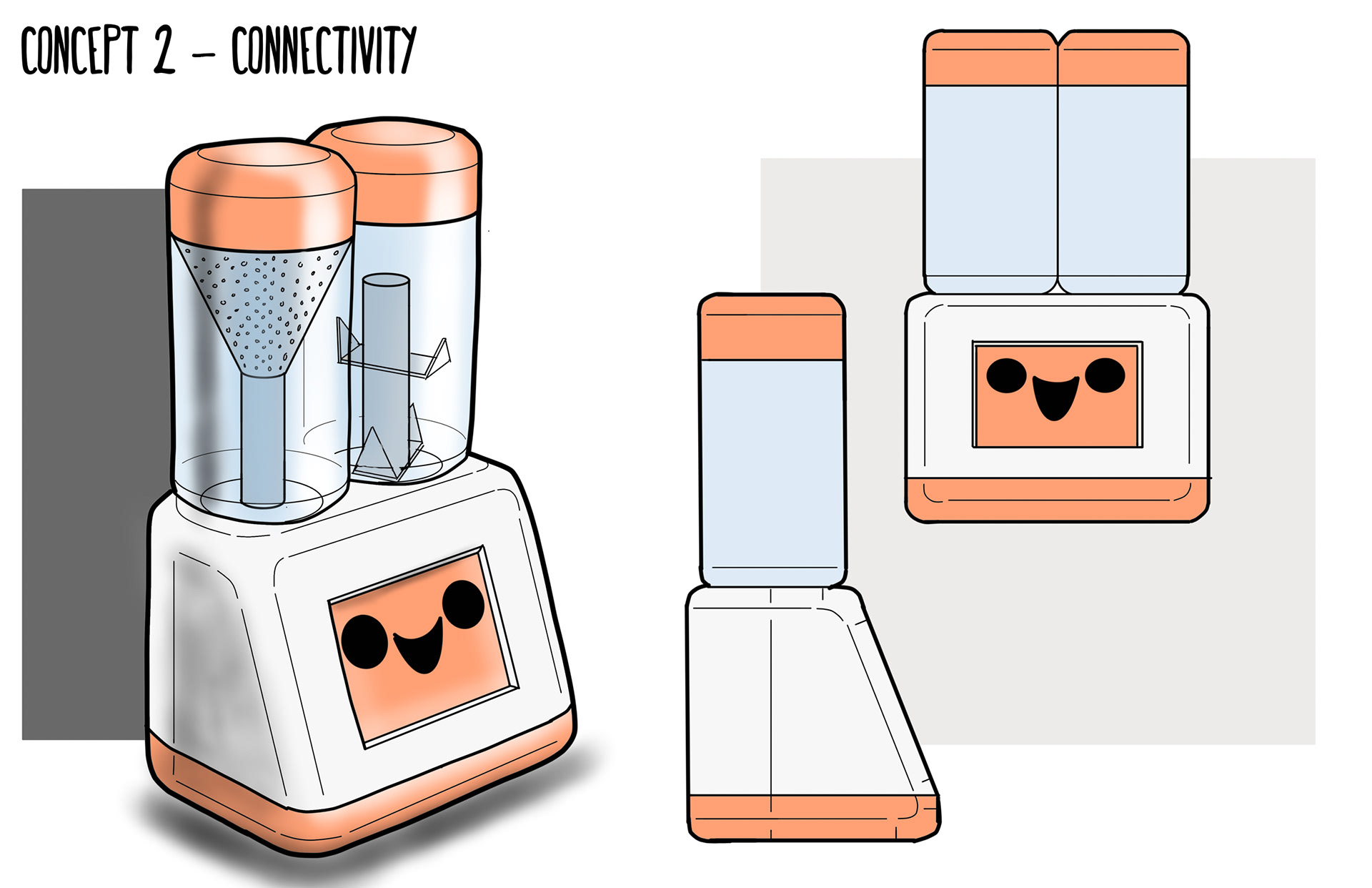
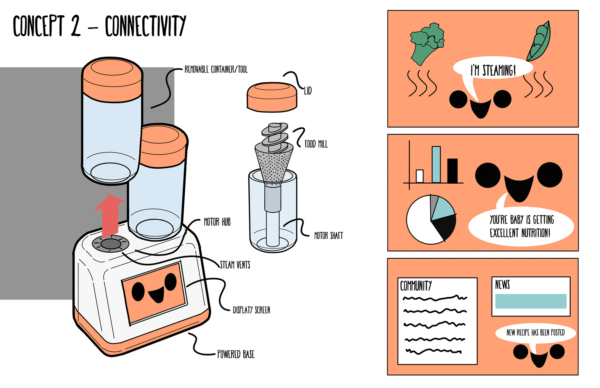
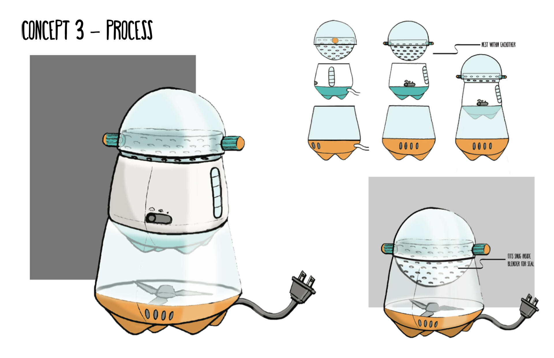
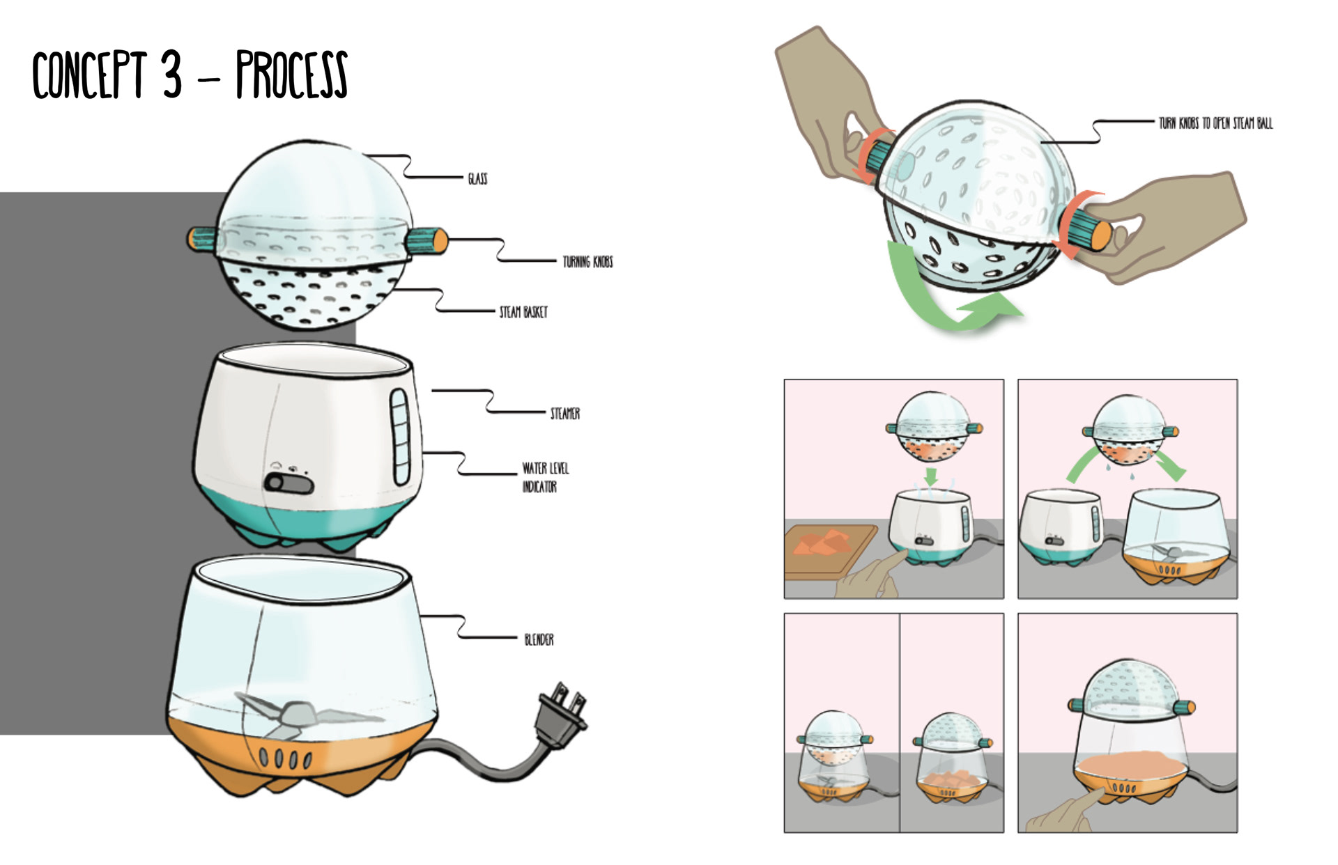
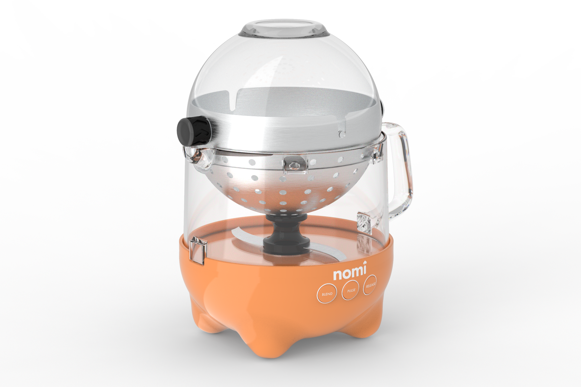
Concept 2, by Cameron Chartier, emphasized IoT connectivity and efficiency. It introduced the idea of a companion character. Concept 3, by Abigail Maeder, clearly separated the two main processes of steaming and blending. It also had a distinctive appearance; it fit our design criteria the best, so we chose it to develop further.
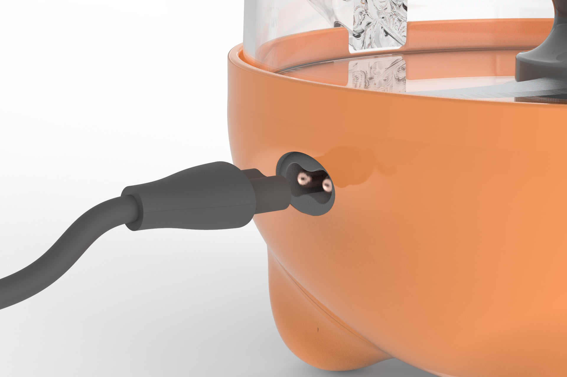
As we further developed the design we merged aspects of my concept with Abigail's -- notably, the shape of the feet, but also practical concerns like the ability to order individual pieces and the power cord that detaches on both ends for easy carrying, pouring, storage, & cleaning.
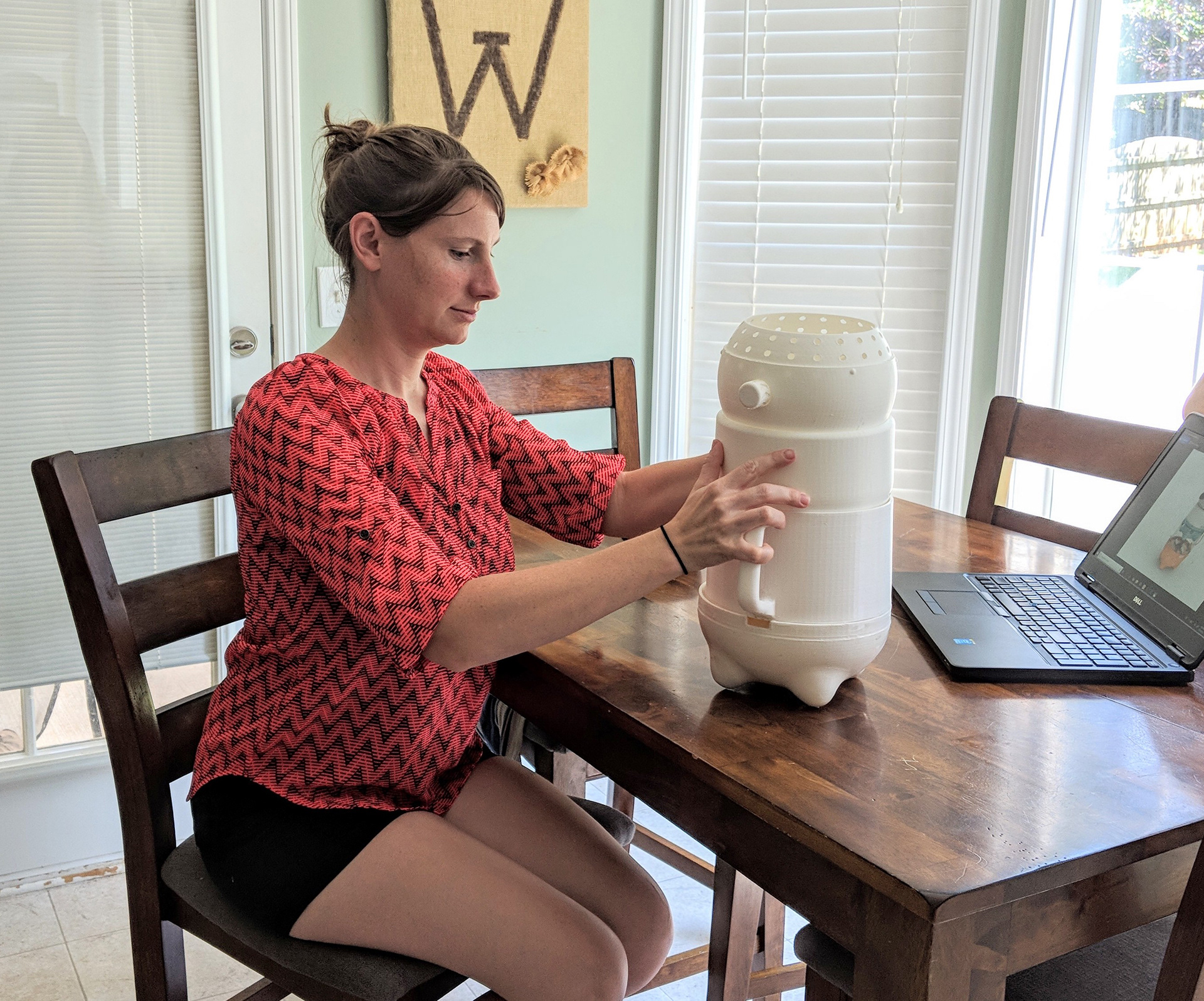
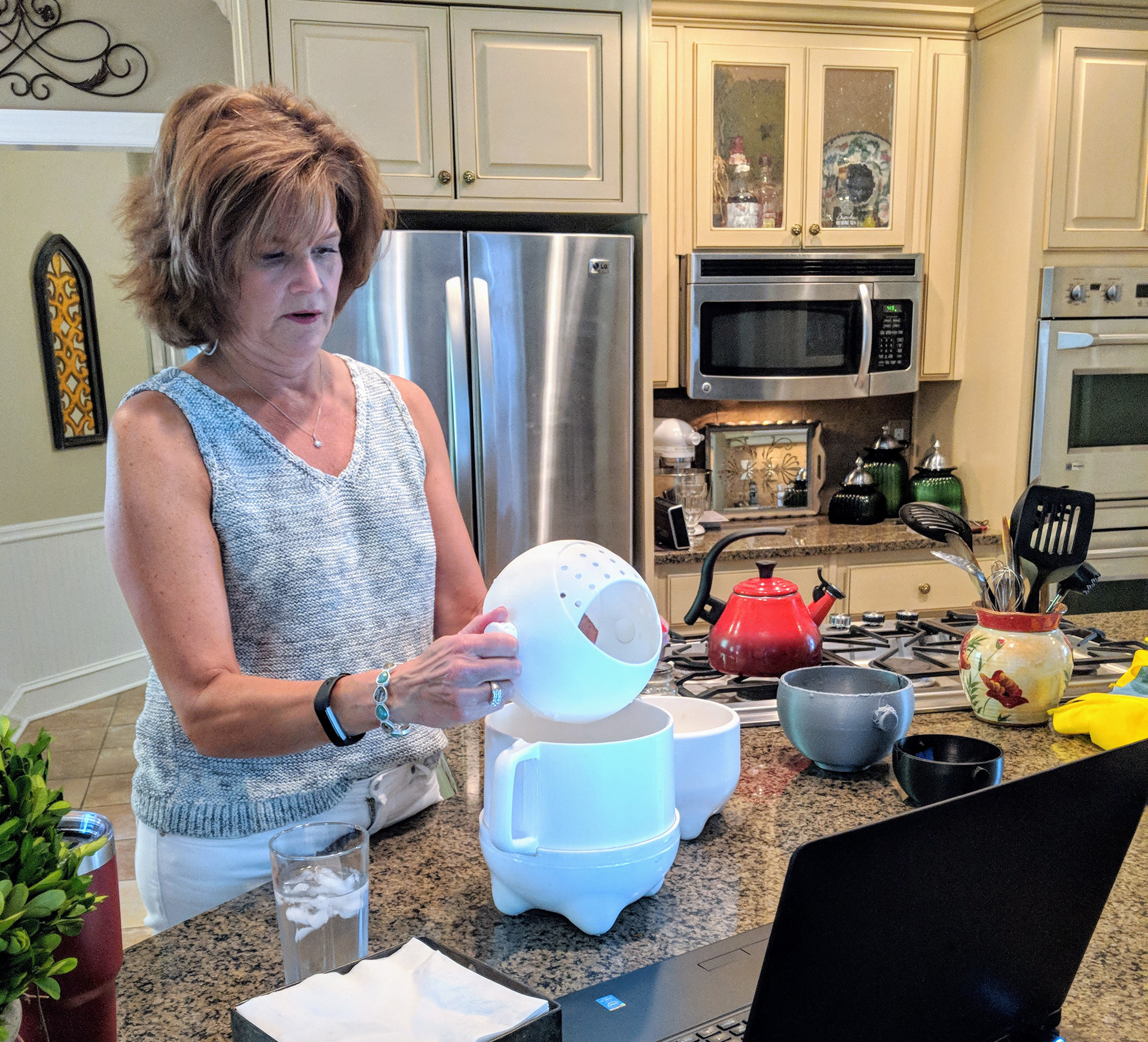
Photos by Rebecca Nicoara and Abigail Maeder
"I love that it's big enough to make large batches"
"It's cute enough to leave on the counter"
"It looks like it's made just for baby food with the two steps connected"
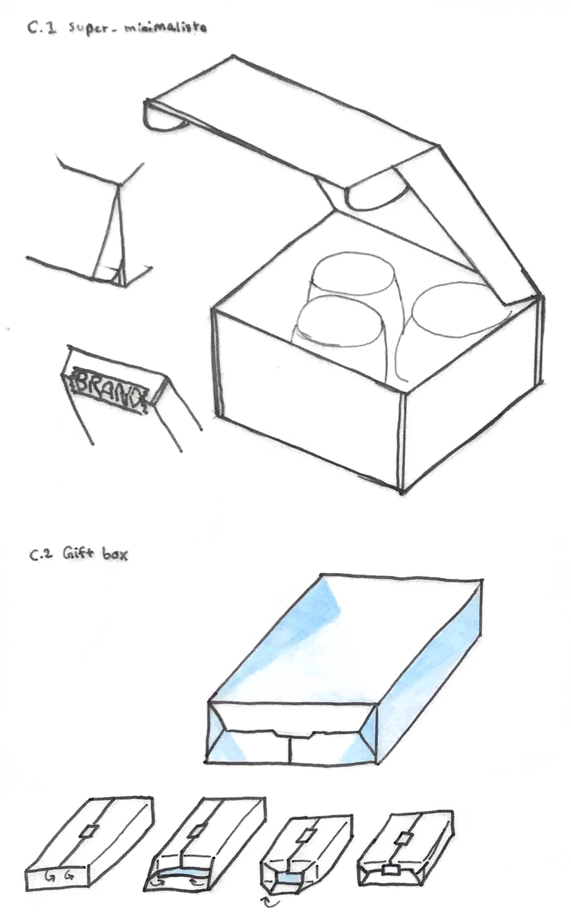
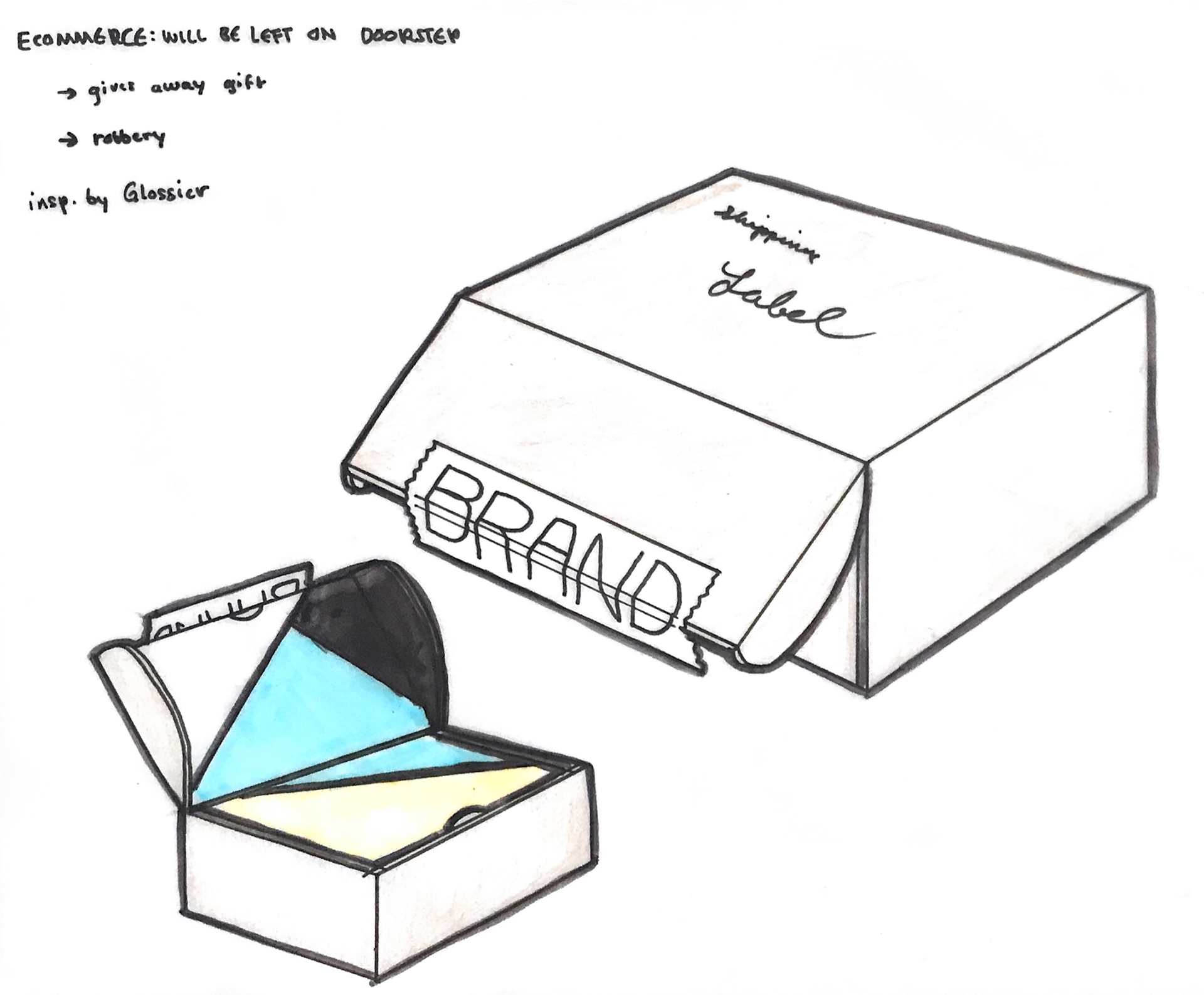
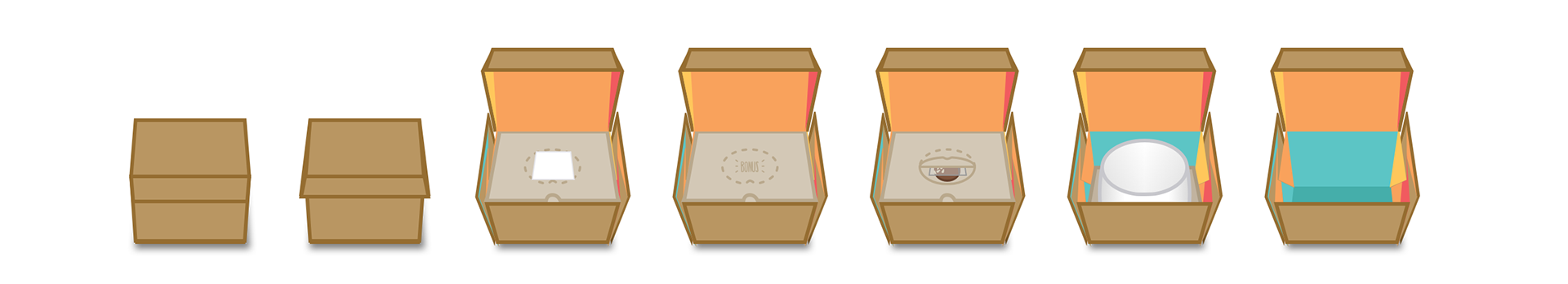
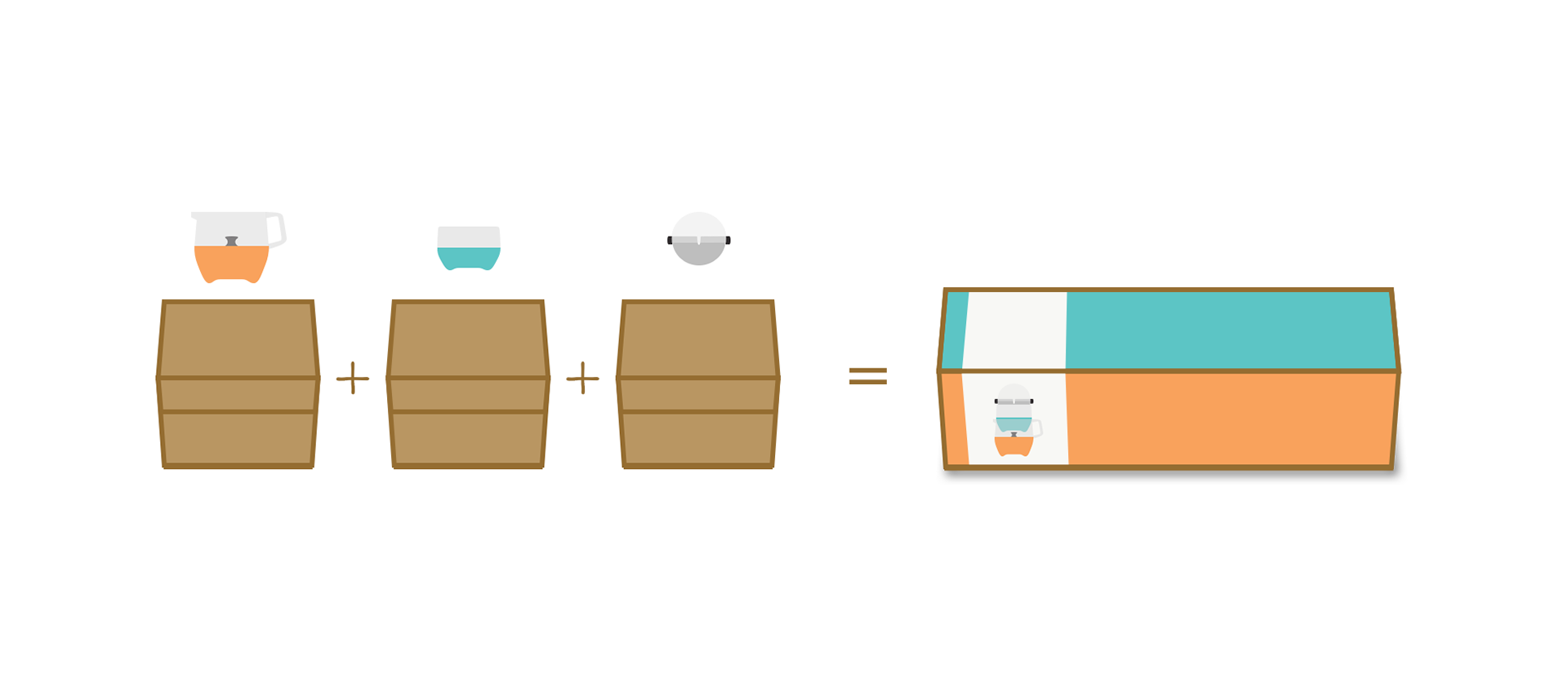
What should our priorities be for packaging?
For online distribution through companies like Amazon and Walmart, there are three important acronyms: PFP, FFP, and SIOC. PFP stands for Prep-Free Packaging, meaning that nothing has to be assembled or changed to make the packaging ready to ship. FFP is Frustration-Free Packaging, referring to the customer's experience when they try to open their package. Lastly, SIOC means Ships In Own Container, where the package doesn't need to be put into another box to be shipped.
There is a delicate balance to be struck for SIOC. The package has to be clearly labeled so distributors can easily and efficiently find the right product to ship, but if it's too obvious what's inside you can run into customer-side problems. A clearly valuable product might get stolen if it's left outside someone's house, and if the wrong person opens the door, they might have their gift spoiled!
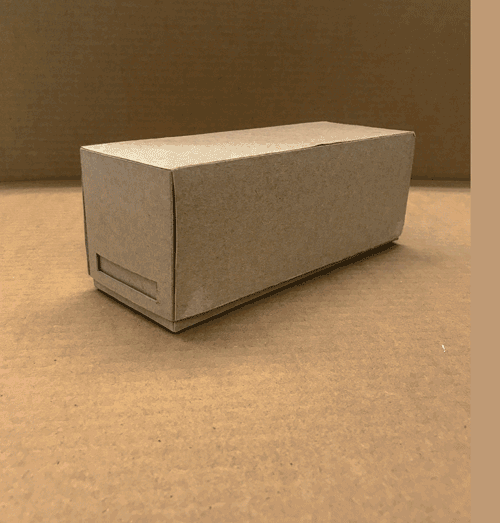
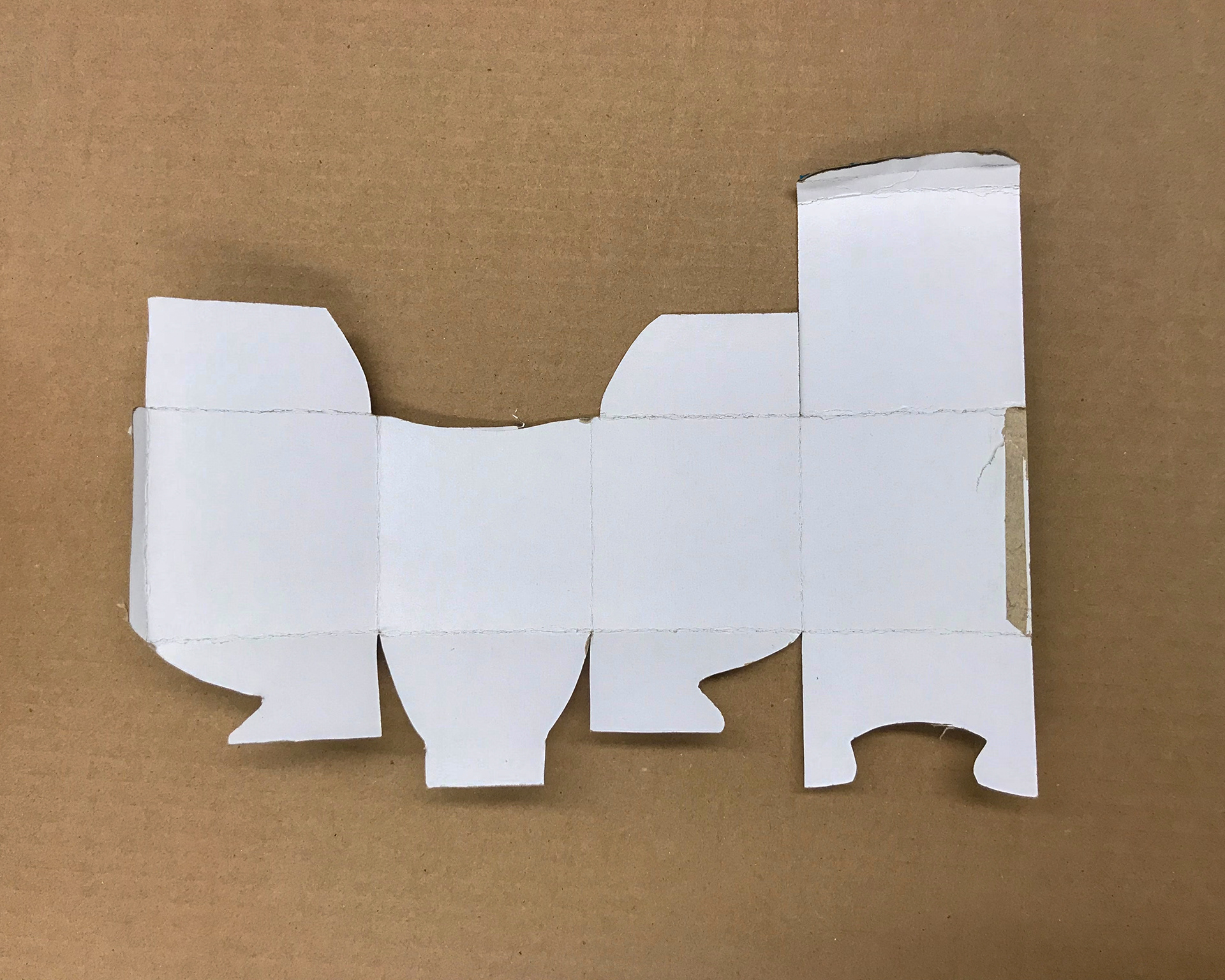
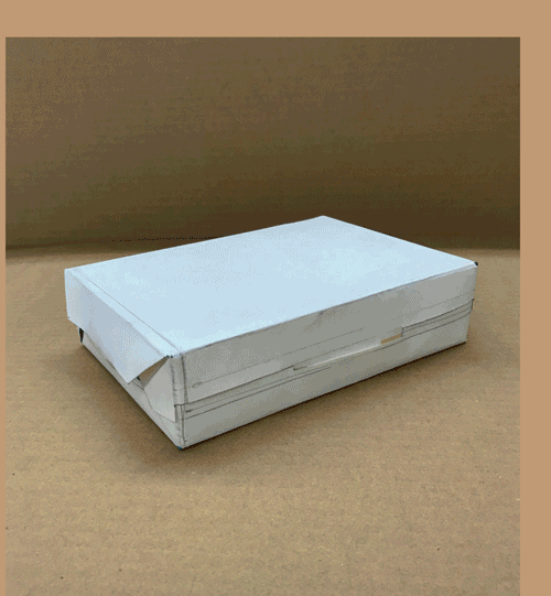
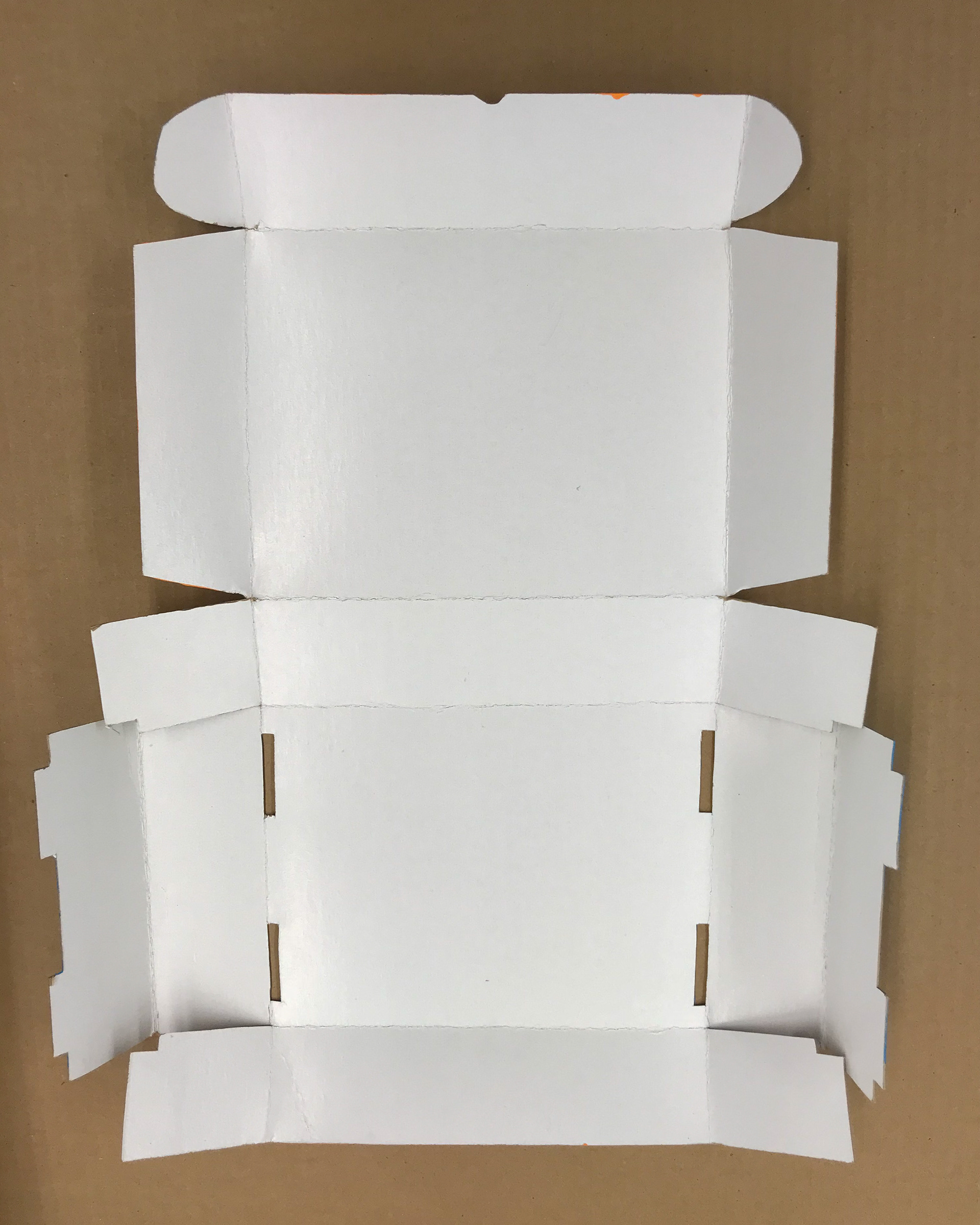
Development
first concepts
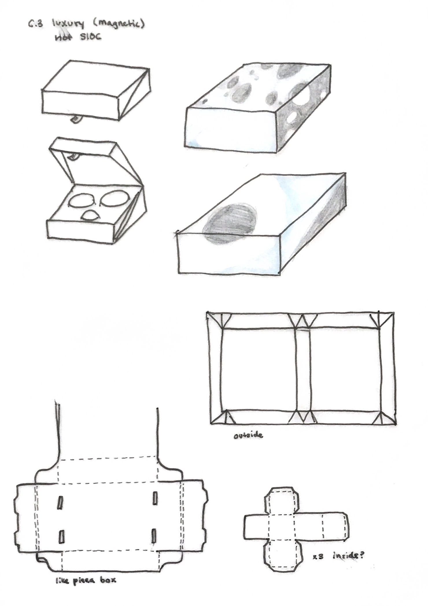
further, with flat lay
concept 1 refined
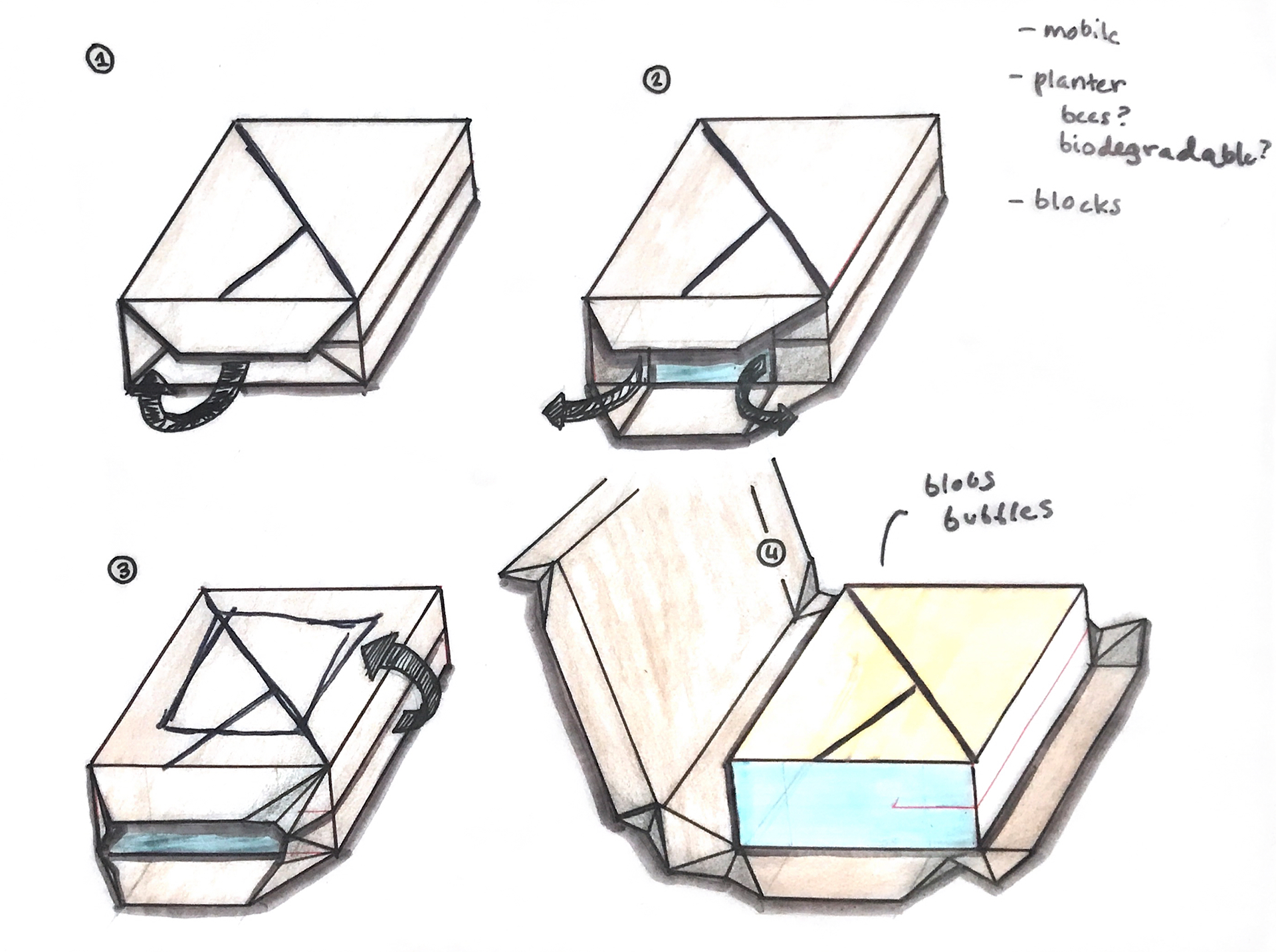
concept 2 in more detail
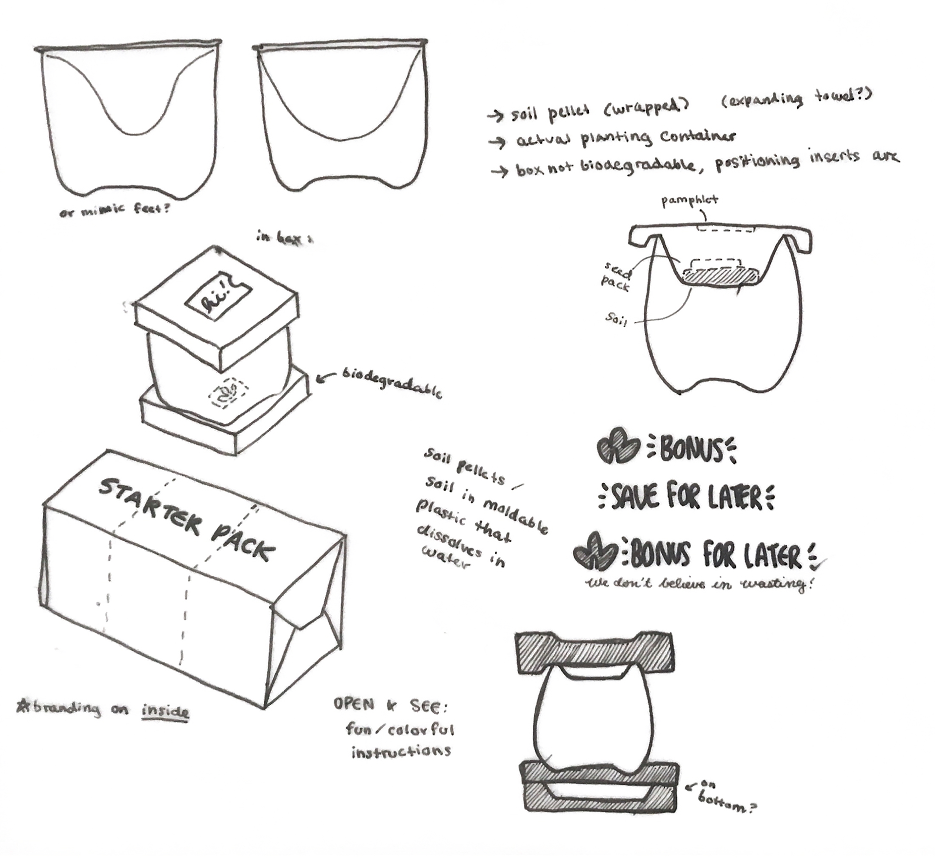
how to protect the product?
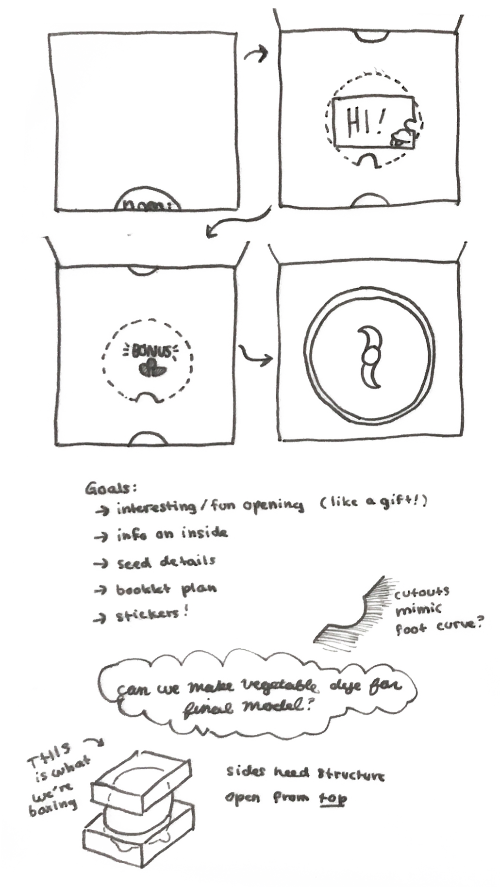
opening experience
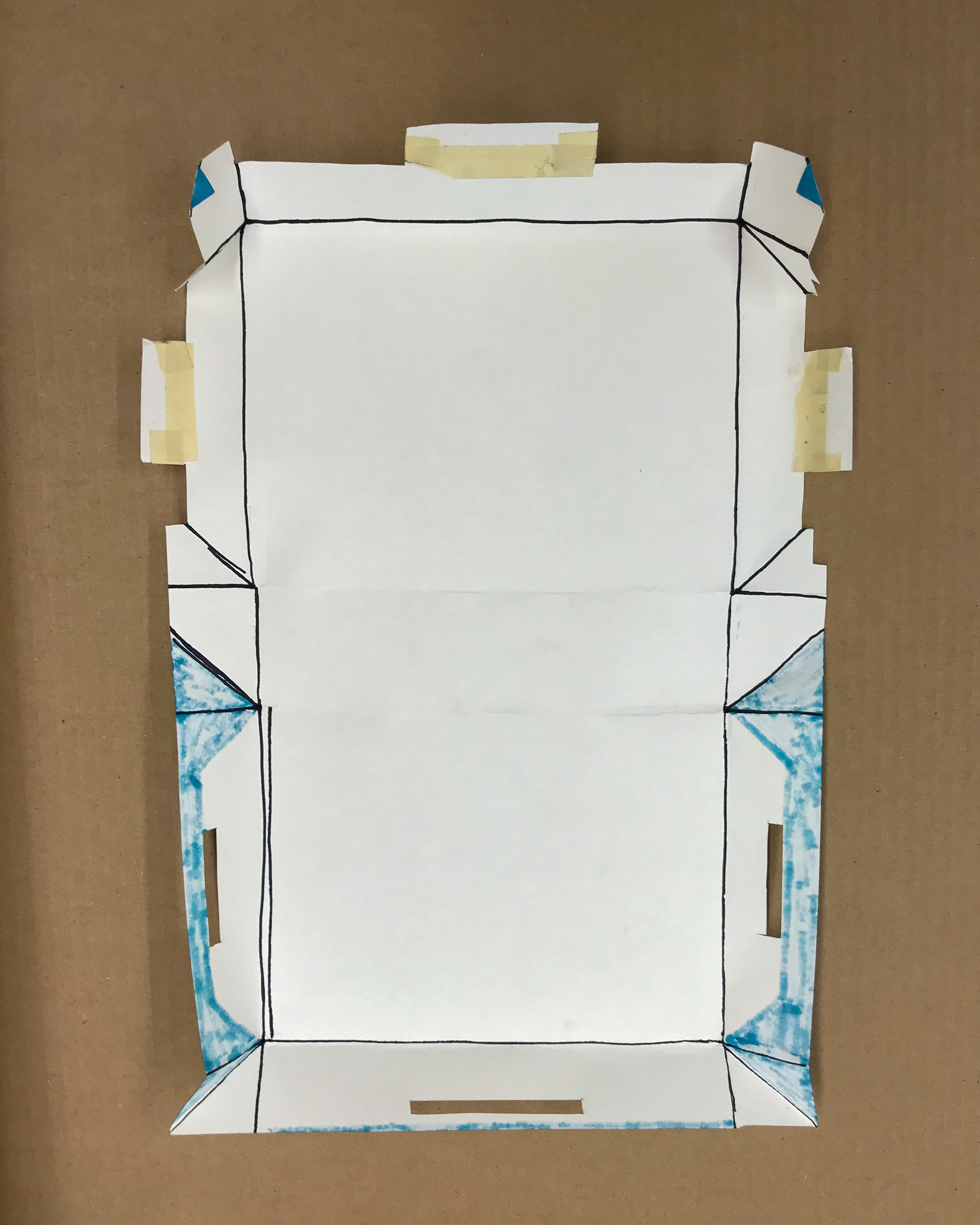

I came up with this during a 7hr car ride

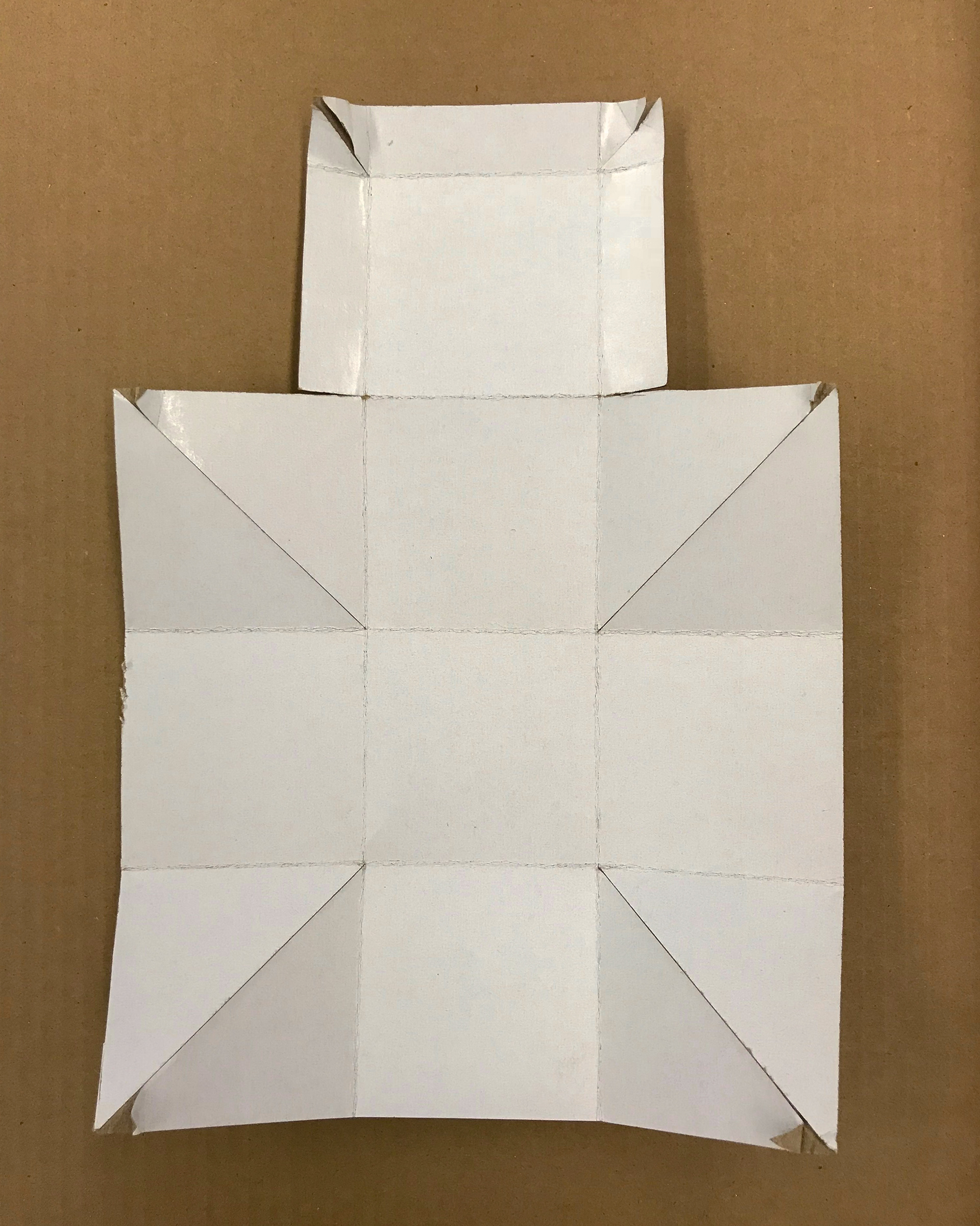
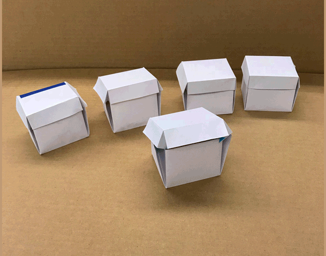
Final Packaging Design
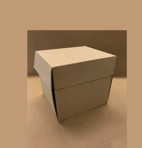
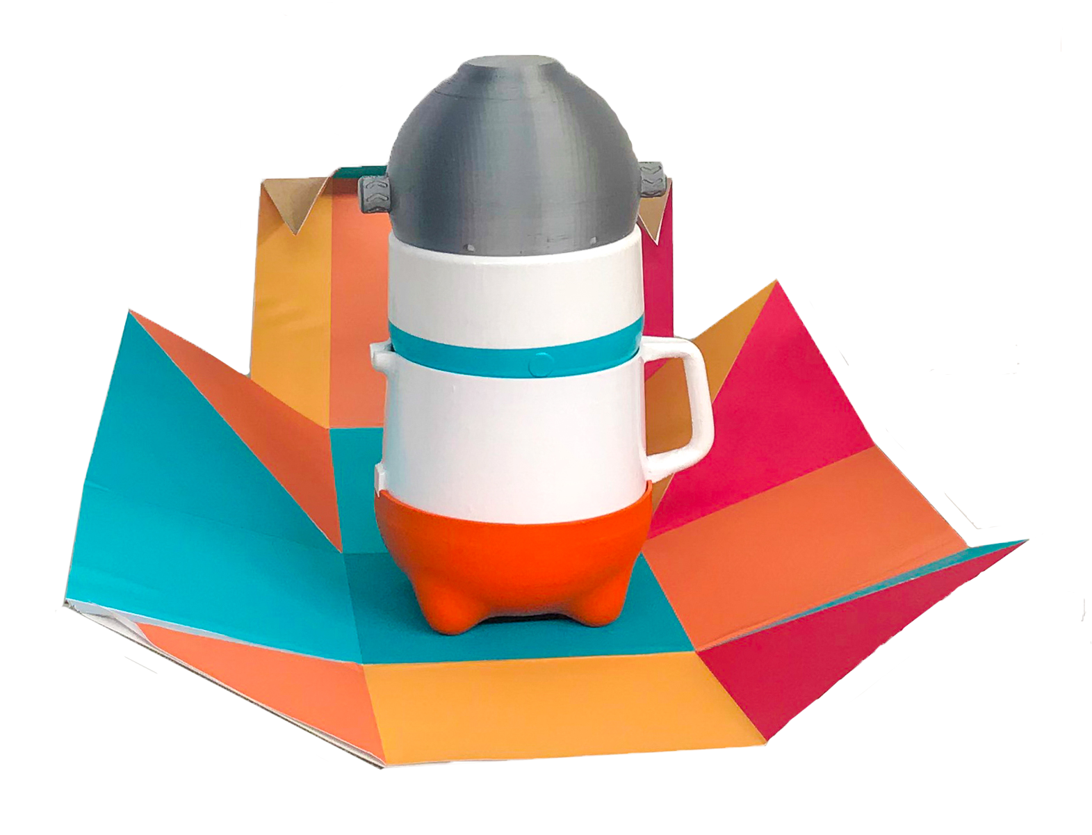
We chose this packaging because it was discreet enough to sit on a doorstep, but quickly opened out into something fun and colorful. It fit our brand philosophy and was unlike anything we'd seen.
We also developed our brand: Nomi, based on "nom", which indicates eating something cutely. We created an accompanying logo and a brand mascot, Bo.

Bo mascot by Abigail Maeder; nomi logo by Rebecca Nicoara
Did it work?
We put our Nomi baby food maker into a lineup with other baby food makers, then asked survey respondents which three products they would click on.
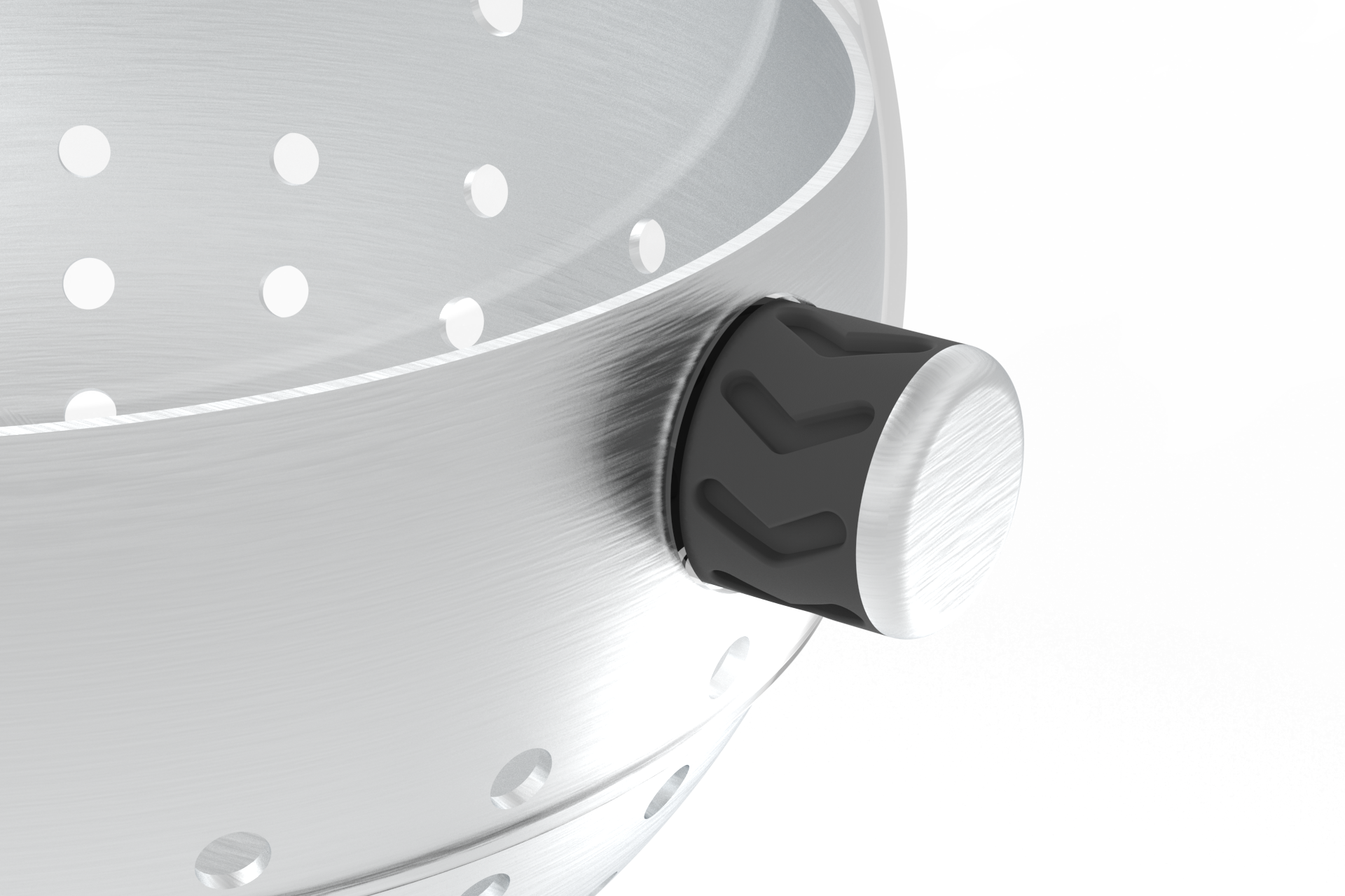
This was shown in the survey
This close-up was NOT used in the survey
44% of respondents put our design in their first three clicks
67% of them chose our design because the picture looked interesting
Render by Jordan Cutsuries